

Novus Design System
Build on the Novus design system
One package carries the whole visual system: design tokens, component styles, the Carlito typeface, dark mode, and the official brand assets. Install it, import one stylesheet, and every screen you build is on-brand by construction.
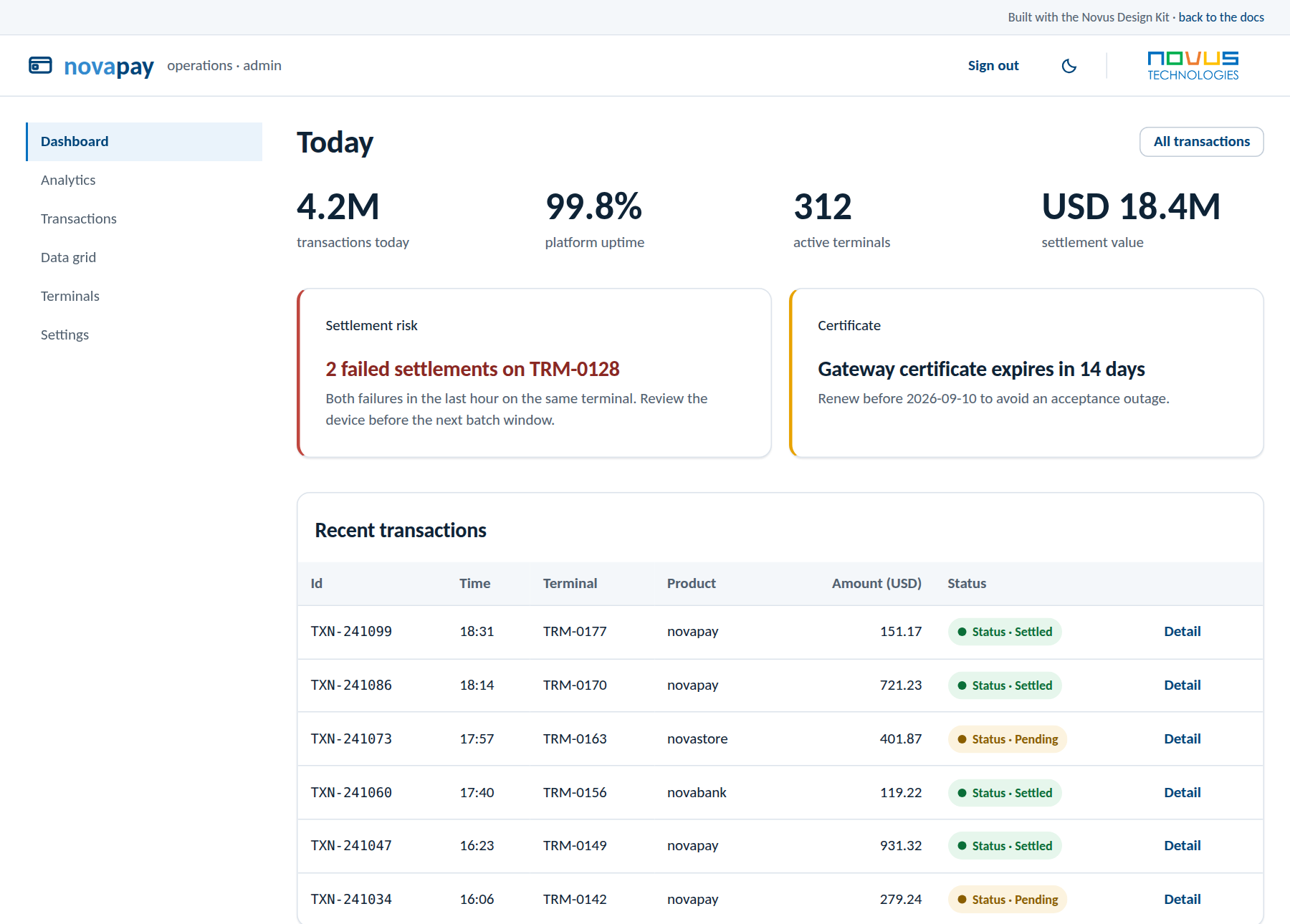
Designed for the operations floor
Trusted, precise, inclusive, enduring: a calm visual language for enterprise products, delivered as Service as Software across banking, payments, and retail.
Enterprise visual language
Monochrome near-flat surfaces, one accent per view, data-dense layouts, AA contrast in both themes. The product's data is the design: no gradients, no decoration.
Token-first components
42 component families from one stylesheet, every value a token. Dark mode is dual-triggered and built in; the persisted toggle ships with the package.
Verified, not promised
Every framework and theme guide is executed in a real project before it ships, with the rendered result on its page. Unverified guides are excluded by the build itself.
Components at a glance
Everything below is rendered live by the kit on this page: buttons, badges, cards, stats, and alerts, all from one stylesheet.
Novus Admin Kit
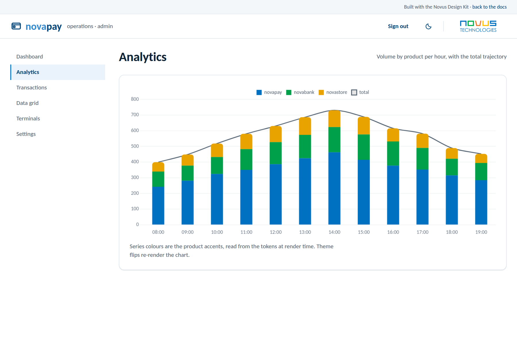
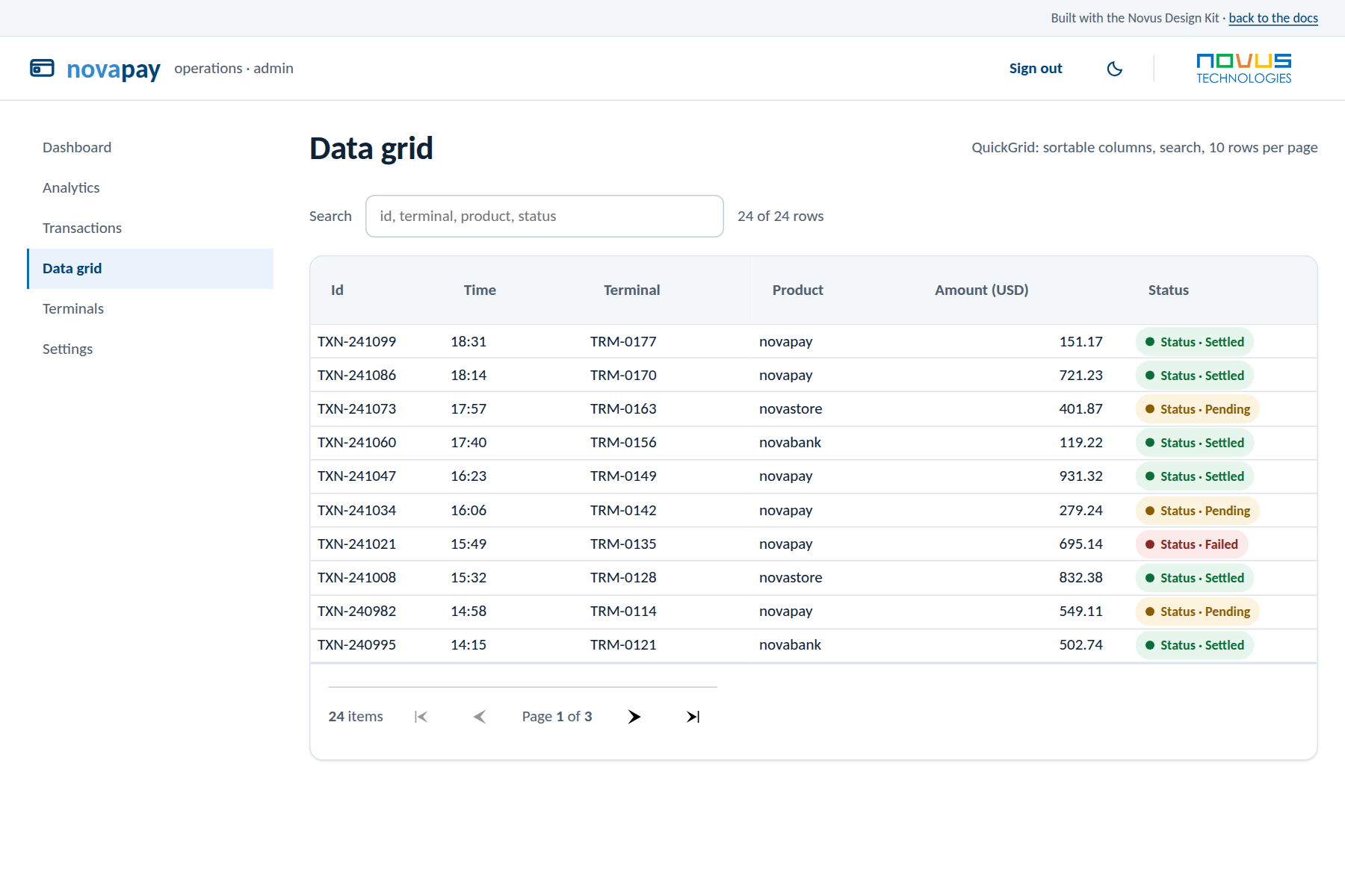
A complete enterprise operations console built on the kit: six screens including analytics with token-fed charts, a data grid, and a sample login, in Blazor, Tailwind, and Material Web flavors with strict parity. Copy a flavor folder and start from a working application, or click straight into the live demos.
Use it with your stack
Framework guides and UI theme guides, each verified in a real sample project with the library version named on the page.
Native mobile foundations: the token mapping for each platform's standard stack.