

Menu
Android foundations
The Novus design system mapped onto native Android the way the Android team
builds: Material 3 as published at m3.material.io, through Material
Components for Android (the View system: XML themes, styles, and resources).
Every value below is taken from tokens.css (rem converts at 16px
per rem to dp/sp), so web and mobile share one source of truth; the build
rejects any colour on this page that is not a token value.
Reference screens
The target, before any code: a novapay operations dashboard on the mapping
below, light and dark. These are reference renderings drawn entirely from
tokens.css (the kit's own classes at device width), not device
screenshots; the starter layout further down reproduces them natively, widget
for widget.
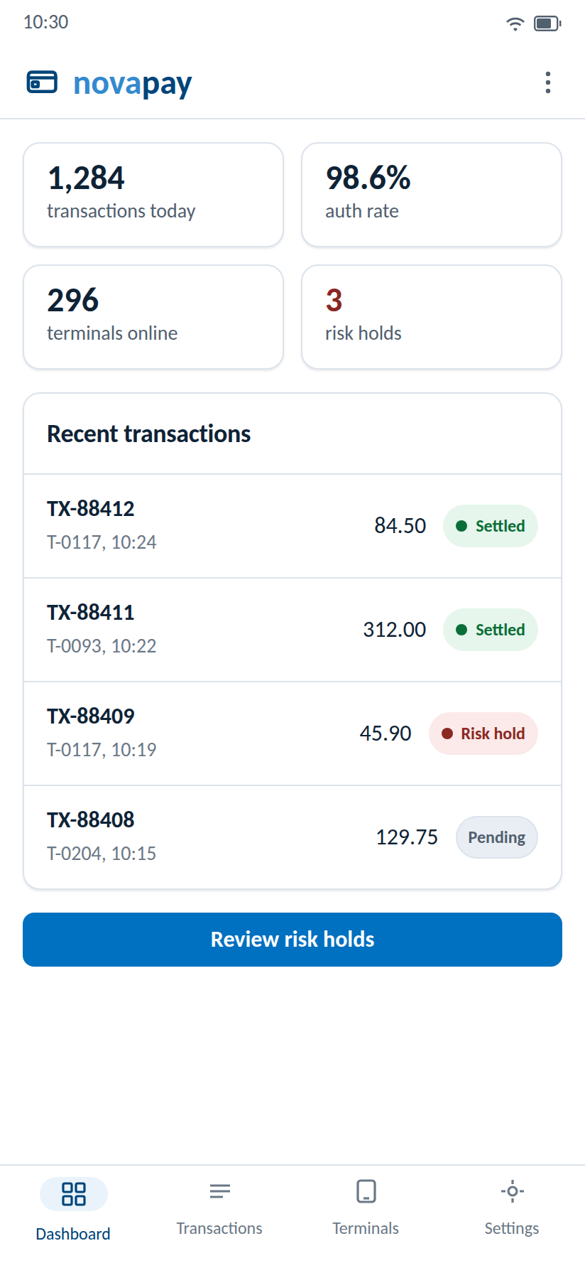
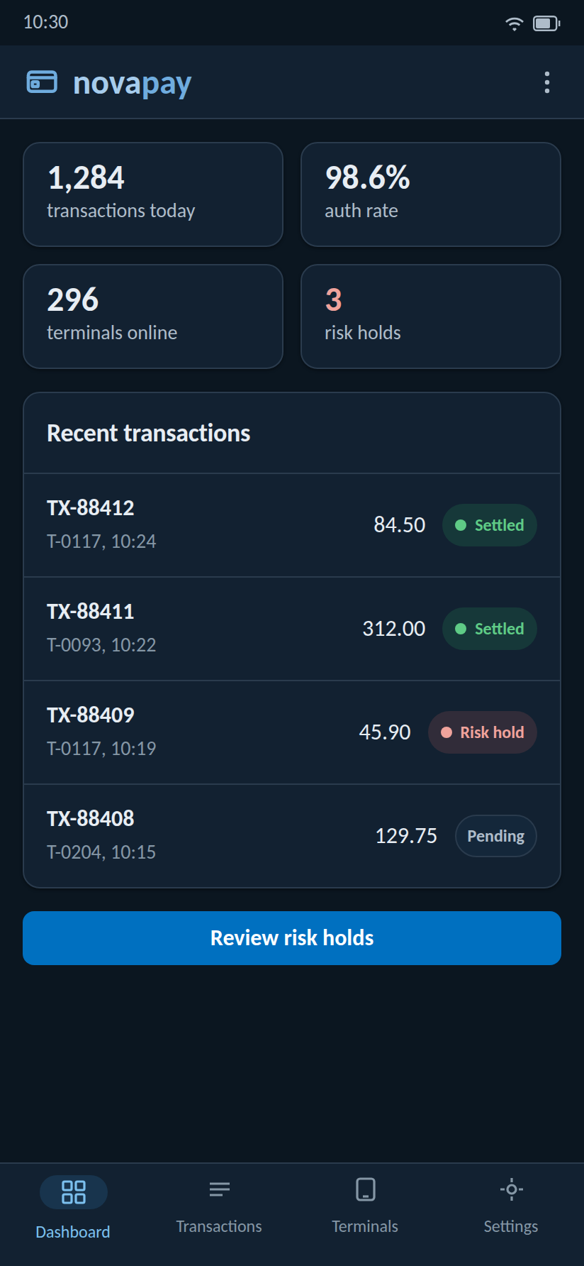
The prototype is the mapping made tappable: four screens (Dashboard, Transactions with filter chips, Terminals, Settings with the persisted theme toggle), navigation on native radio inputs so it works with JavaScript off, and a native bottom-sheet detail dialog. Open it at phone width, or install-free on an actual phone.
Color resources
Define the palette once in res/values/colors.xml, override in
res/values-night/colors.xml: the resource system is the platform's
own light/dark switch, mirroring the web tokens' dark block.
<!-- res/values/colors.xml (light) -->
<resources>
    <color name="novus_accent">#0070C0</color>         <!-- accent (blue-500) -->
    <color name="novus_on_accent">#FFFFFF</color>      <!-- text-on-accent -->
    <color name="novus_accent_subtle">#EAF3FB</color>  <!-- blue-50 -->
    <color name="novus_accent_text">#00457A</color>    <!-- blue-700 -->
    <color name="novus_bg">#FFFFFF</color>             <!-- bg: white ground, always -->
    <color name="novus_surface">#FFFFFF</color>
    <color name="novus_surface_variant">#F4F7FA</color><!-- bg-subtle (neutral-50) -->
    <color name="novus_text">#0E2336</color>           <!-- neutral-900 -->
    <color name="novus_text_secondary">#51606F</color> <!-- neutral-600 -->
    <color name="novus_border">#DCE3EB</color>         <!-- neutral-200 -->
    <color name="novus_danger">#C0473F</color>         <!-- red-400 -->
    <color name="novus_danger_text">#8A2823</color>    <!-- red-600 -->
    <color name="novus_success">#00A04A</color>        <!-- green-500: judgements only -->
    <color name="novus_warning">#E8A300</color>        <!-- amber-400: judgements only -->
</resources>

<!-- res/values-night/colors.xml (the web tokens' dark block) -->
<resources>
    <color name="novus_accent">#0070C0</color>         <!-- accent holds in dark -->
    <color name="novus_accent_subtle">#073355</color>  <!-- blue-800 -->
    <color name="novus_accent_text">#7CC0EE</color>    <!-- dark accent-text -->
    <color name="novus_bg">#0B1620</color>             <!-- neutral-950 -->
    <color name="novus_surface">#122131</color>
    <color name="novus_surface_variant">#18293B</color><!-- surface-raised -->
    <color name="novus_text">#E7EDF3</color>
    <color name="novus_text_secondary">#AEBCC9</color>
    <color name="novus_border">#2A3B4D</color>
    <color name="novus_danger">#D56A61</color>         <!-- red-300 -->
    <color name="novus_danger_text">#F0A39C</color>
    <color name="novus_success">#2BB266</color>
    <color name="novus_warning">#E8A300</color>
</resources>
Theme: Material 3 color roles
<!-- res/values/themes.xml -->
<style name="Theme.Novus" parent="Theme.Material3.DayNight.NoActionBar">
    <item name="colorPrimary">@color/novus_accent</item>
    <item name="colorOnPrimary">@color/novus_on_accent</item>
    <item name="colorPrimaryContainer">@color/novus_accent_subtle</item>
    <item name="colorOnPrimaryContainer">@color/novus_accent_text</item>
    <item name="colorSecondary">@color/novus_text_secondary</item>
    <item name="android:colorBackground">@color/novus_bg</item>
    <item name="colorOnBackground">@color/novus_text</item>
    <item name="colorSurface">@color/novus_surface</item>
    <item name="colorOnSurface">@color/novus_text</item>
    <item name="colorSurfaceVariant">@color/novus_surface_variant</item>
    <item name="colorOnSurfaceVariant">@color/novus_text_secondary</item>
    <item name="colorOutline">@color/novus_border</item>
    <item name="colorError">@color/novus_danger</item>
    <item name="colorOnError">@color/novus_on_accent</item>
    <!-- kit shape scale: radius-sm/md/lg -->
    <item name="shapeAppearanceCornerSmall">@style/Shape.Novus.Small</item>
    <item name="shapeAppearanceCornerMedium">@style/Shape.Novus.Medium</item>
    <item name="shapeAppearanceCornerLarge">@style/Shape.Novus.Large</item>
</style>

<style name="Shape.Novus.Small" parent="ShapeAppearance.Material3.Corner.Small">
    <item name="cornerSize">6dp</item>   <!-- radius-sm -->
</style>
<style name="Shape.Novus.Medium" parent="ShapeAppearance.Material3.Corner.Medium">
    <item name="cornerSize">8dp</item>   <!-- radius-md -->
</style>
<style name="Shape.Novus.Large" parent="ShapeAppearance.Material3.Corner.Large">
    <item name="cornerSize">12dp</item>  <!-- radius-lg -->
</style>- Do not enable dynamic color (
DynamicColors.applyToActivitiesIfAvailablestays out): the brand palette is the palette. - Success and warning never enter the theme roles: reference them directly, and only where a judgement exists.
Typography: Carlito only
Bundle Carlito 400 and 700 in res/font/ (TTF from the design
system master or Google Fonts; this npm package ships woff2 for the web only),
declare the family, and map the kit type scale (sp respects platform font
scaling; never disable it).
<!-- res/font/carlito.xml -->
<font-family xmlns:app="http://schemas.android.com/apk/res-auto">
    <font app:fontStyle="normal" app:fontWeight="400" app:font="@font/carlito_regular"/>
    <font app:fontStyle="normal" app:fontWeight="700" app:font="@font/carlito_bold"/>
</font-family>

<!-- the kit type scale, rem times 16 = sp: 2xl 30, xl 24, lg 20, md 18, base 16, sm 14, xs 12 -->
<style name="TextAppearance.Novus.Headline" parent="TextAppearance.Material3.HeadlineSmall">
    <item name="fontFamily">@font/carlito</item>
    <item name="android:textSize">24sp</item>   <!-- text-xl -->
    <item name="android:textStyle">bold</item>
</style>
<style name="TextAppearance.Novus.Body" parent="TextAppearance.Material3.BodyLarge">
    <item name="fontFamily">@font/carlito</item>
    <item name="android:textSize">16sp</item>   <!-- text-base -->
</style>
Spacing
<!-- res/values/dimens.xml: --space-1 .. --space-8, rem times 16 = dp -->
<resources>
    <dimen name="novus_space_1">4dp</dimen>  <dimen name="novus_space_2">8dp</dimen>
    <dimen name="novus_space_3">12dp</dimen> <dimen name="novus_space_4">16dp</dimen>
    <dimen name="novus_space_5">24dp</dimen> <dimen name="novus_space_6">32dp</dimen>
    <dimen name="novus_space_7">48dp</dimen> <dimen name="novus_space_8">64dp</dimen>
</resources>
Dark mode: dual trigger, same as the web
DayNight plus the resource system follows the OS; a persisted
in-app override is the second trigger, matching the web kit's toggle.
// persist "system" | "light" | "dark" (SharedPreferences or DataStore)
fun applyThemePref(pref: String) = AppCompatDelegate.setDefaultNightMode(
    when (pref) {
        "light" -> AppCompatDelegate.MODE_NIGHT_NO
        "dark"  -> AppCompatDelegate.MODE_NIGHT_YES
        else    -> AppCompatDelegate.MODE_NIGHT_FOLLOW_SYSTEM
    }
)
Component themes
Give every widget its Novus form once, in the theme, so screens stay clean:
<!-- default widget styles, referenced from Theme.Novus -->
<style name="Widget.Novus.Button" parent="Widget.Material3.Button">
    <item name="shapeAppearance">@style/Shape.Novus.Medium</item>
    <item name="android:textAppearance">@style/TextAppearance.Novus.Body</item>
</style>

<style name="Widget.Novus.Card" parent="Widget.Material3.CardView.Outlined">
    <item name="strokeColor">?attr/colorOutline</item>
    <item name="strokeWidth">1dp</item>
    <item name="cardElevation">0dp</item>
    <item name="shapeAppearance">@style/Shape.Novus.Large</item>
</style>

<style name="Widget.Novus.Chip" parent="Widget.Material3.Chip.Assist">
    <item name="chipStrokeColor">?attr/colorOutline</item>
    <item name="android:textAppearance">@style/TextAppearance.Novus.Body</item>
</style>

<!-- hook them into the theme -->
<style name="Theme.Novus" parent="Theme.Material3.DayNight.NoActionBar">
    <item name="materialButtonStyle">@style/Widget.Novus.Button</item>
    <item name="materialCardViewStyle">@style/Widget.Novus.Card</item>
    <item name="chipStyle">@style/Widget.Novus.Chip</item>
    <!-- plus the color/shape items shown above -->
</style>
Starter layout: the reference dashboard
Reproduces the reference screens with stock Material Components under
Theme.Novus: KPI cards, a transaction list, and bottom navigation.
<!-- res/layout/activity_dashboard.xml (abridged: one KPI card, one list row) -->
<androidx.coordinatorlayout.widget.CoordinatorLayout
    xmlns:android="http://schemas.android.com/apk/res/android"
    xmlns:app="http://schemas.android.com/apk/res-auto"
    android:layout_width="match_parent" android:layout_height="match_parent">

  <com.google.android.material.appbar.MaterialToolbar
      android:id="@+id/topBar"
      android:layout_width="match_parent" android:layout_height="?attr/actionBarSize"
      app:logo="@drawable/novapay_lockup" />  <!-- placed asset, never typed text -->

  <androidx.core.widget.NestedScrollView
      android:layout_width="match_parent" android:layout_height="match_parent"
      android:padding="@dimen/novus_space_4">
    <LinearLayout android:orientation="vertical"
        android:layout_width="match_parent" android:layout_height="wrap_content">

      <com.google.android.material.card.MaterialCardView
          android:layout_width="match_parent" android:layout_height="wrap_content">
        <LinearLayout android:orientation="vertical"
            android:padding="@dimen/novus_space_4"
            android:layout_width="match_parent" android:layout_height="wrap_content">
          <TextView android:text="1,284"
              android:textAppearance="@style/TextAppearance.Novus.Headline"
              android:layout_width="wrap_content" android:layout_height="wrap_content"/>
          <TextView android:text="transactions today"
              android:textColor="?attr/colorOnSurfaceVariant"
              android:layout_width="wrap_content" android:layout_height="wrap_content"/>
        </LinearLayout>
      </com.google.android.material.card.MaterialCardView>

      <!-- transaction row: RecyclerView item with a judgement chip -->
      <LinearLayout android:orientation="horizontal" android:gravity="center_vertical"
          android:padding="@dimen/novus_space_3"
          android:layout_width="match_parent" android:layout_height="wrap_content">
        <TextView android:text="TX-88412" style="@style/TextAppearance.Novus.Body"
            android:layout_width="0dp" android:layout_weight="1"
            android:layout_height="wrap_content"/>
        <TextView android:text="84.50"
            android:layout_width="wrap_content" android:layout_height="wrap_content"/>
        <com.google.android.material.chip.Chip android:text="Settled"
            android:layout_marginStart="@dimen/novus_space_3"
            android:layout_width="wrap_content" android:layout_height="wrap_content"/>
      </LinearLayout>
    </LinearLayout>
  </androidx.core.widget.NestedScrollView>

  <com.google.android.material.bottomnavigation.BottomNavigationView
      android:layout_width="match_parent" android:layout_height="wrap_content"
      android:layout_gravity="bottom"
      app:menu="@menu/dashboard_nav" />
</androidx.coordinatorlayout.widget.CoordinatorLayout>- Amounts stay neutral text; the chip carries the judgement colour (Settled green, Risk hold red), exactly like the reference screens.
- The toolbar logo is the placed novapay lockup drawable from
logos/lockups/; typing the name is a defect.
Component correspondence
| Kit component | Material Components (View system) | Notes |
|---|---|---|
| .btn --primary | MaterialButton (filled) | One per screen (one accent per view) |
| .btn --secondary | MaterialButton, Widget.Material3.Button.OutlinedButton | 1dp outline, no tonal fill |
| .btn --ghost | MaterialButton, Widget.Material3.Button.TextButton | |
| .card | MaterialCardView with strokeWidth 1dp, strokeColor colorOutline, cardElevation 0 | Border over shadow, near-flat |
| .badge / chips | Chip (Widget.Material3.Chip.Assist) | Self-describing labels; judgement colours only on judgements |
| .table | RecyclerView rows with outline dividers | Dense rows |
| .alert | Snackbar / inline MaterialCardView | Risk messages always the danger colour |
| .modal | MaterialAlertDialogBuilder / BottomSheetDialogFragment | Confirm far-right per Actions & placement |
| .field / .input | TextInputLayout (OutlinedBox) | |
| Stepper (progress) | LinearLayout of numbered chips | Build the pattern from chips; current step is the only accent |
Rules that carry over unchanged
- White (or near-black) ground, no gradients, elevation as a 1dp outline over shadow.
- One accent per view; success and warning only where a judgement exists; risk messages always red; amounts always neutral.
- Product names lowercase and solid-set (novapay); logos are placed assets from
logos/(drawable imports), never redrawn or typed. - Touch targets 44dp minimum; test at small-phone width first.