

Novus Admin Kit
A complete, realistic enterprise starting point built on the design kit: a novapay
operations console with a sign-in page, a dashboard, a filterable transactions list,
a data grid, a terminal fleet view, settings, and a signed-out page, built on the
console patterns from the novalending reference: split sign-in, grouped side
navigation with a drawer on phones, page headers with breadcrumbs, a filter bar with
a sub-filter sheet, list footer pagination, and single-line content everywhere. It ships in three flavors with strict screen parity (Blazor, Tailwind, and
Material Web), all consuming the published novus-design-kit package. Copy a flavor folder
from the repository and start from a working, on-brand application.
Getting started
Two ways in, depending on where you are starting from. Both flavors pull
novus-design-kit from the public npm registry: no tokens, no registry
configuration.
Path A: copy a working flavor (recommended)
Each flavor folder is a complete, runnable application. Get the repository, copy the folder you want, and it becomes your project.
# get the repository (any of these)
git clone https://github.com/novustechdev/novus-design-ui.git
gh repo clone novustechdev/novus-design-ui
# or download the ZIP from https://github.com/novustechdev/novus-design-ui
#   (Code button, then Download ZIP) and unpack it

# take a flavor folder as your starting point
cp -r novus-design-ui/admin-kits/tailwind my-console    # Vite + Tailwind flavor
cp -r novus-design-ui/admin-kits/material my-console    # Vite + Material Web flavor
cp -r novus-design-ui/admin-kits/blazor   my-console    # Blazor Server flavor
cp -r novus-design-ui/admin-kits/data     my-console-data   # optional: the shared dataset generator
Then run it. Tailwind flavor:
cd my-console
npm install     # pulls novus-design-kit and d3
npm run dev     # develop; npm run build for the production bundle
Blazor flavor (.NET 10 SDK required):
cd my-console
npm install     # pulls novus-design-kit; the build copies it to wwwroot/lib
dotnet run
Path B: add the kit to an existing app
npm install novus-design-kit d3- Import
novus-design-kit/tokens.cssand the pre-paint theme scriptnovus-design-kit/js/novus-theme.jsfirst, exactly as your framework guide shows. - Since 0.4.0 you do not copy the console patterns at all: import
novus-design-kit/console.cssandnovus-design-kit/js/novus-console.jsand you have the sign-in page, shell, side navigation, page header, user menu, filter bar, list footer, settings layout, chart styling and the content-fit rules. See Install. - The screens themselves are self-contained pages you can lift one at a time; the D3 chart source is
novus-chart.jsbeside them. - The demo dataset and the parity generator live in
admin-kits/data/;node generate.mjsre-emits every flavor's data, shared layer copies, console shell, icons, and the WebAssembly demo mirrors, andnode generate.mjs --checkfails when any copy has drifted (a release gate).
Screens and conventions
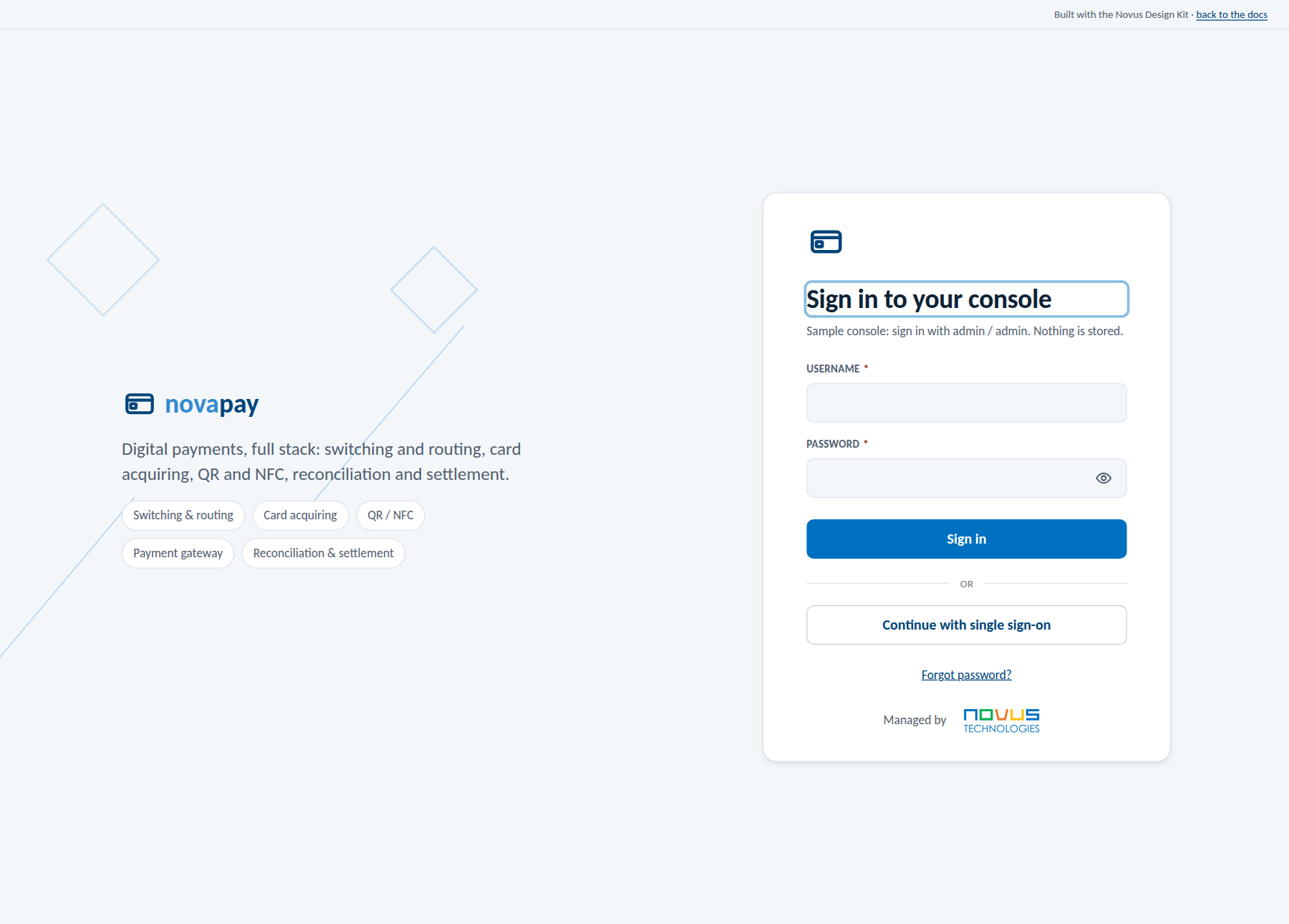
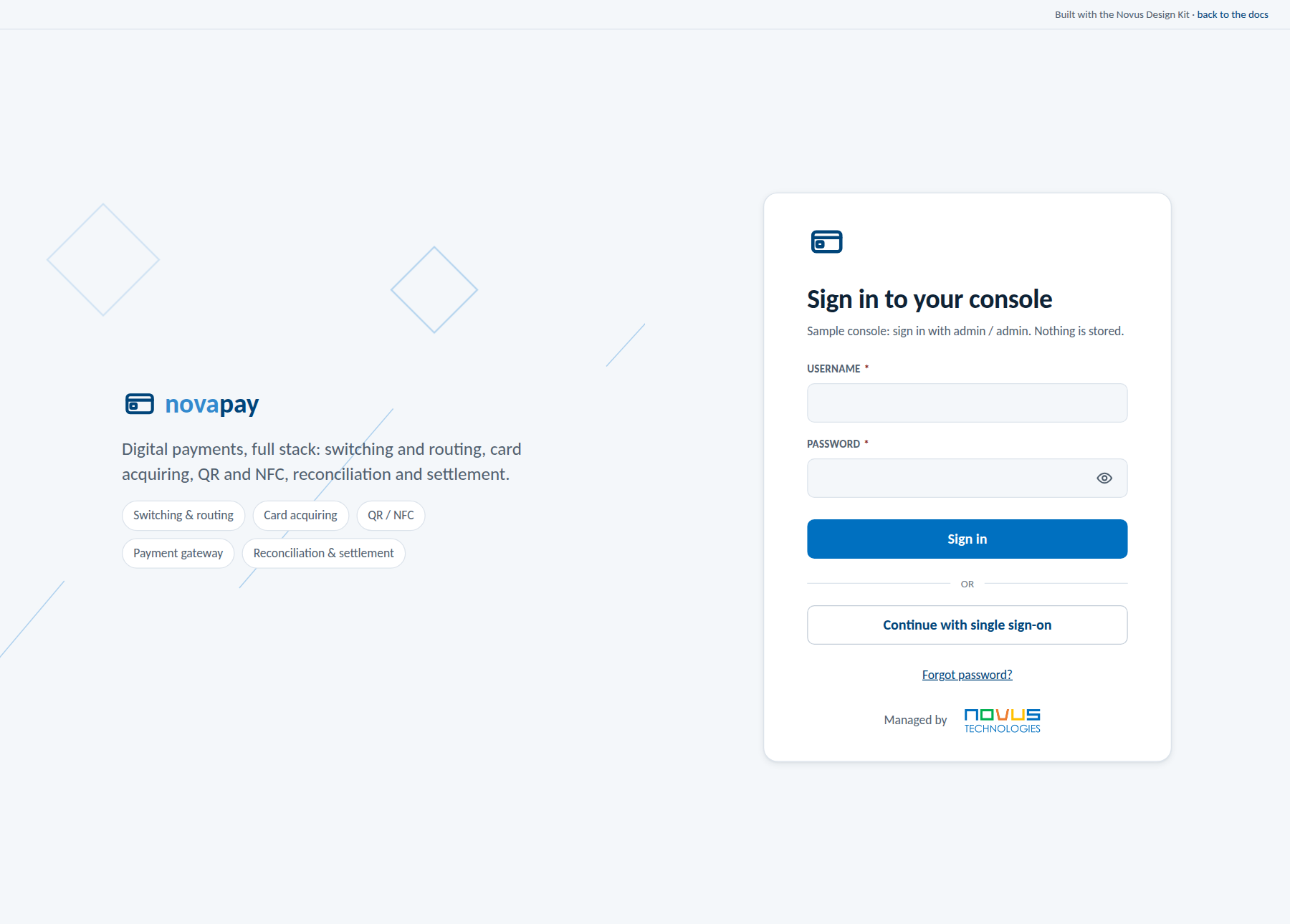
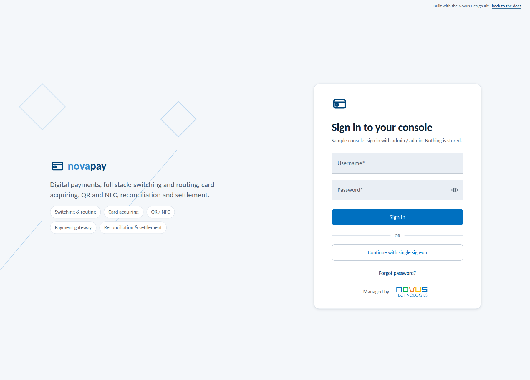
- Sign-in: a 50/50 split on the kit's near-white ground with ambient line art on the panel and single sign-on beside the password form; small-caps labels, filled inputs, a show and hide password button, one inline error that keeps the username, a reset disclosure, and the Novus endorsement. Sample credentials: admin / admin.
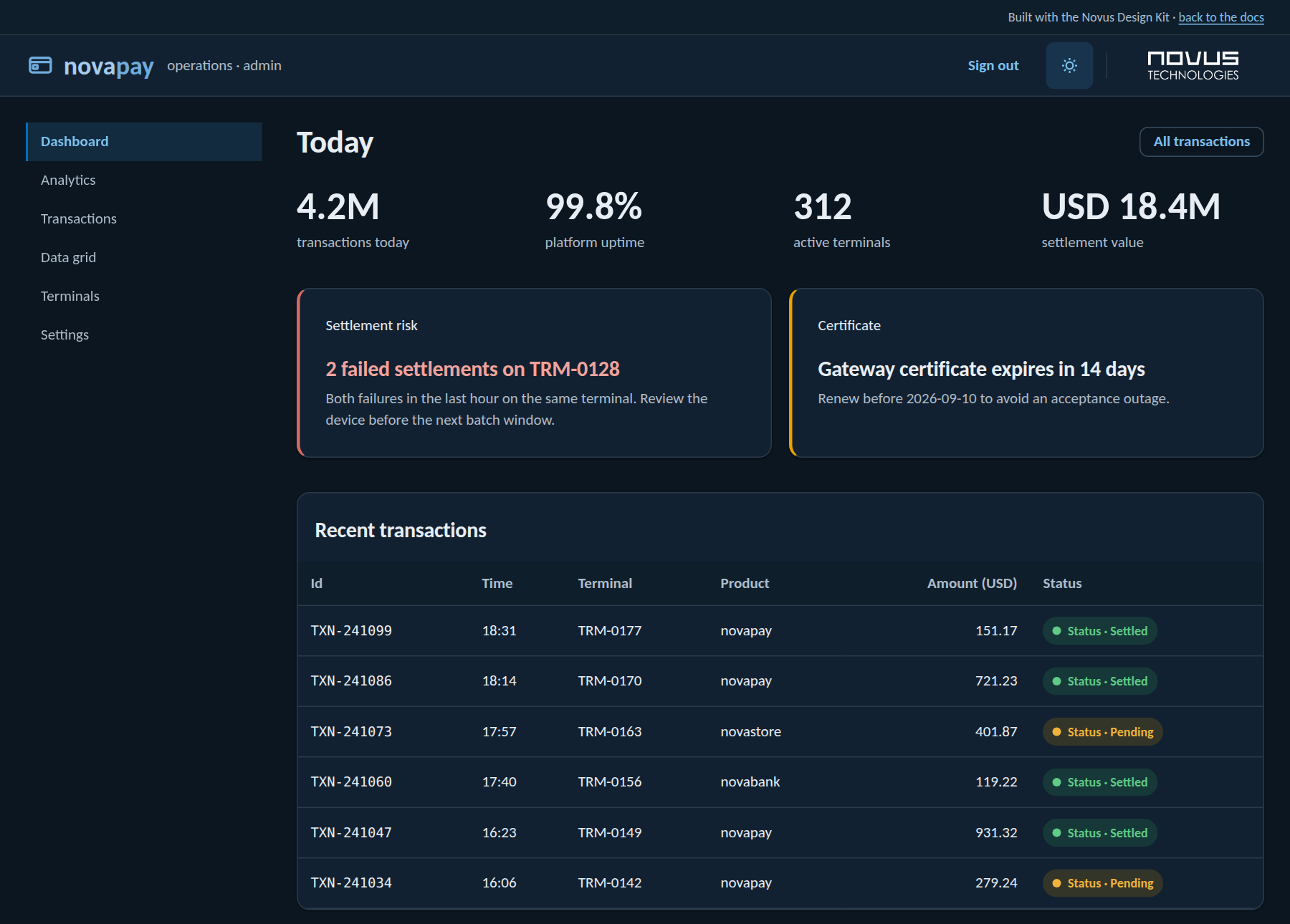
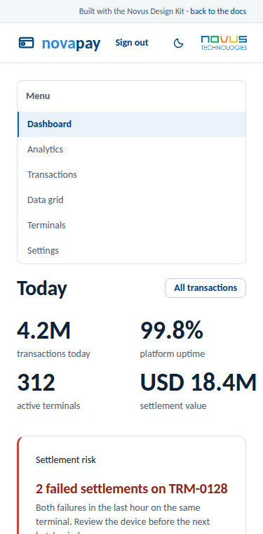
- Dashboard: KPI stat row, signal cards (risk always red, watch amber), interactive D3 statistics (volume by hour, product mix) beside their table, and recent transactions.
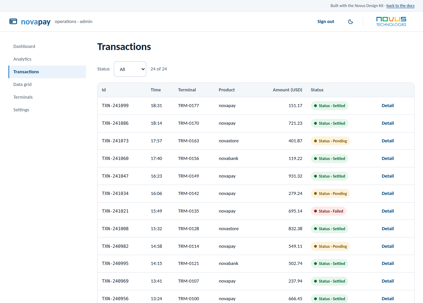
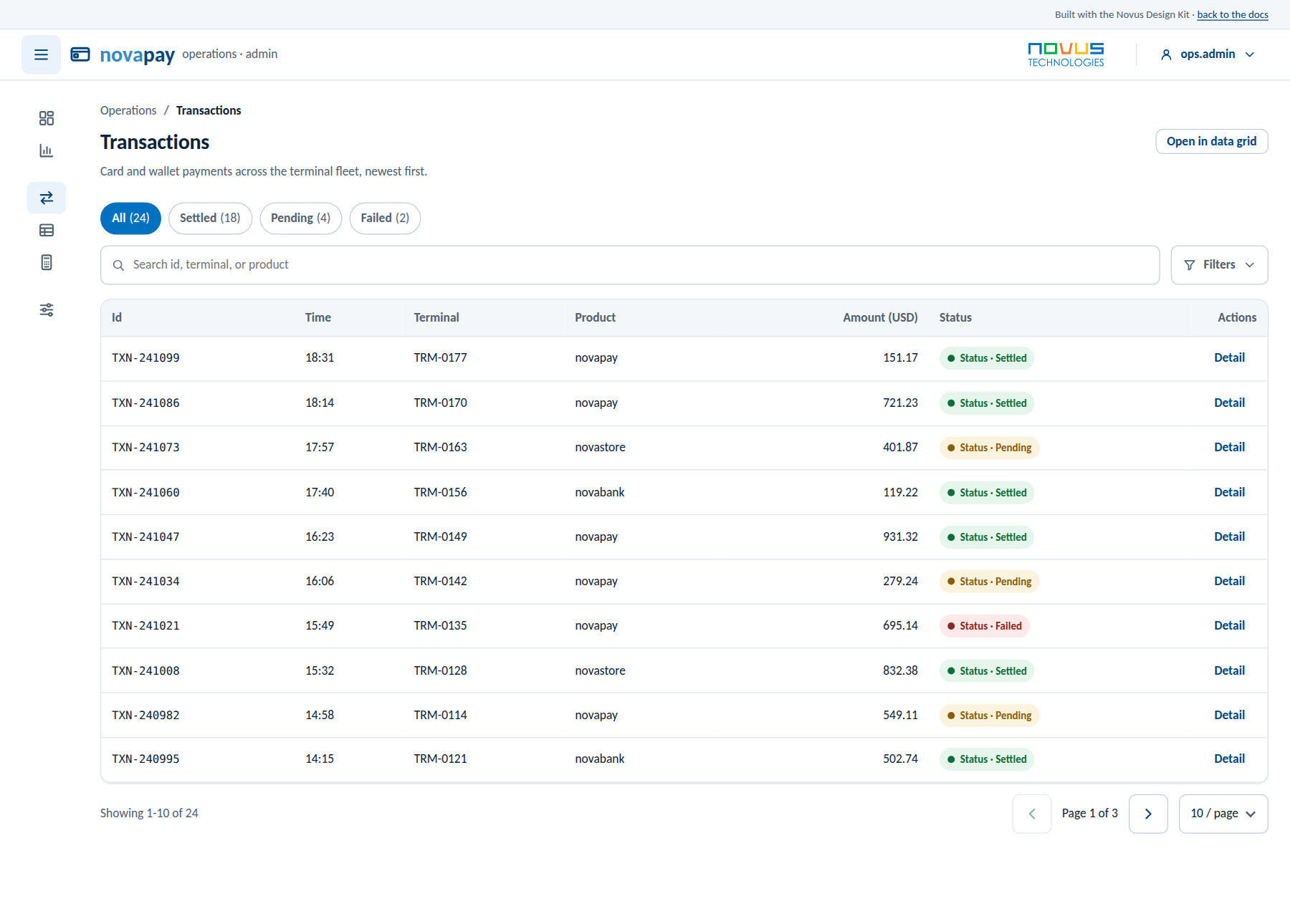
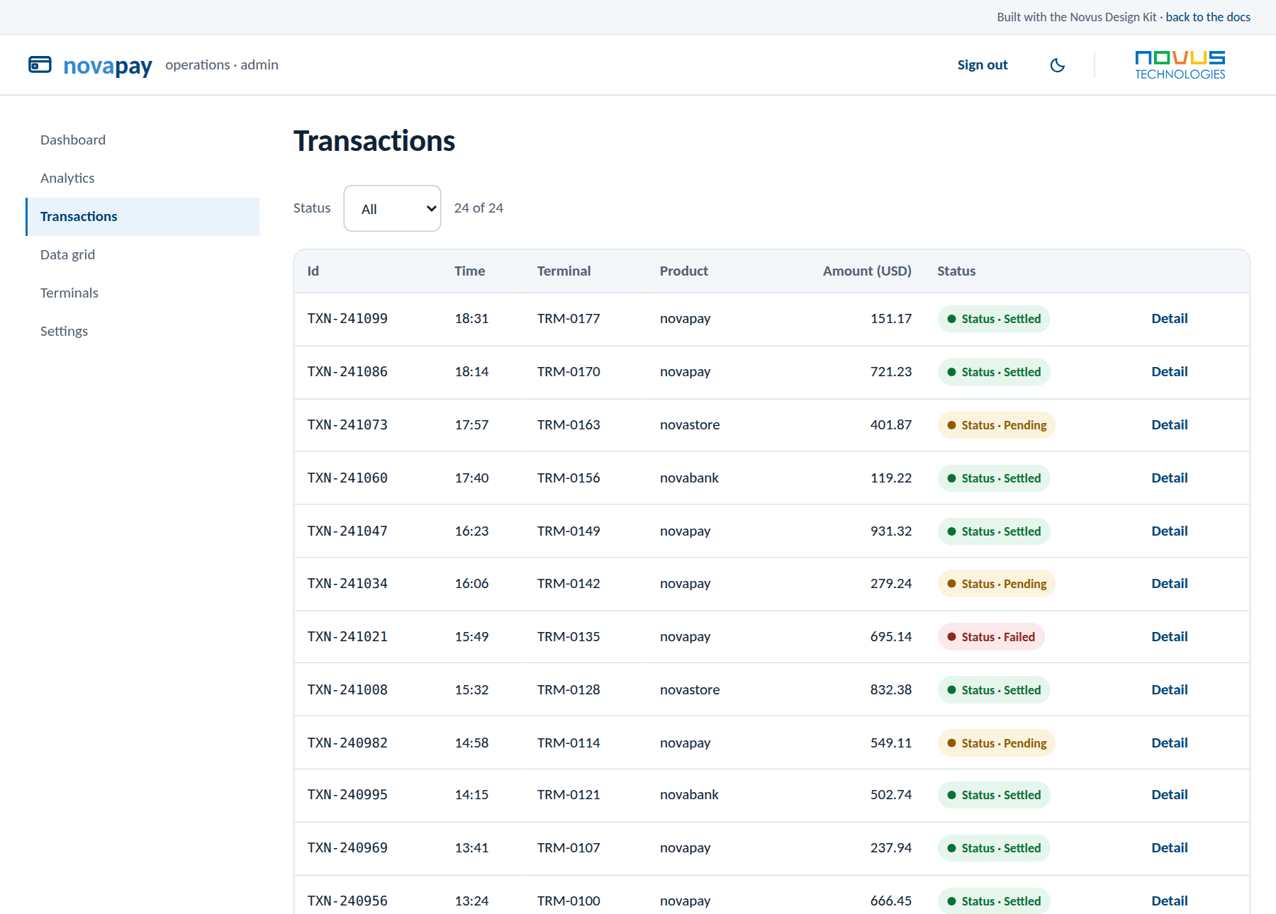
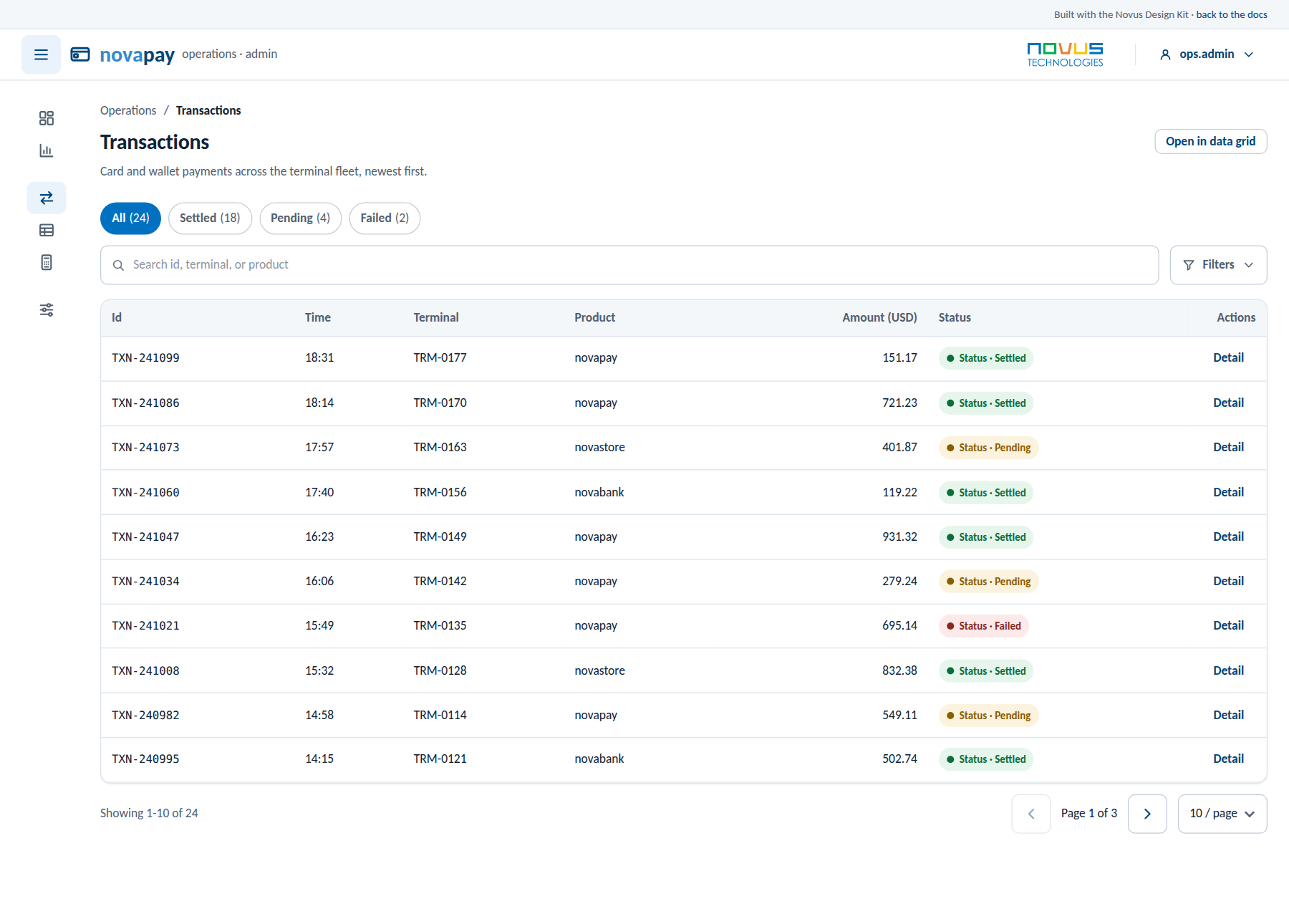
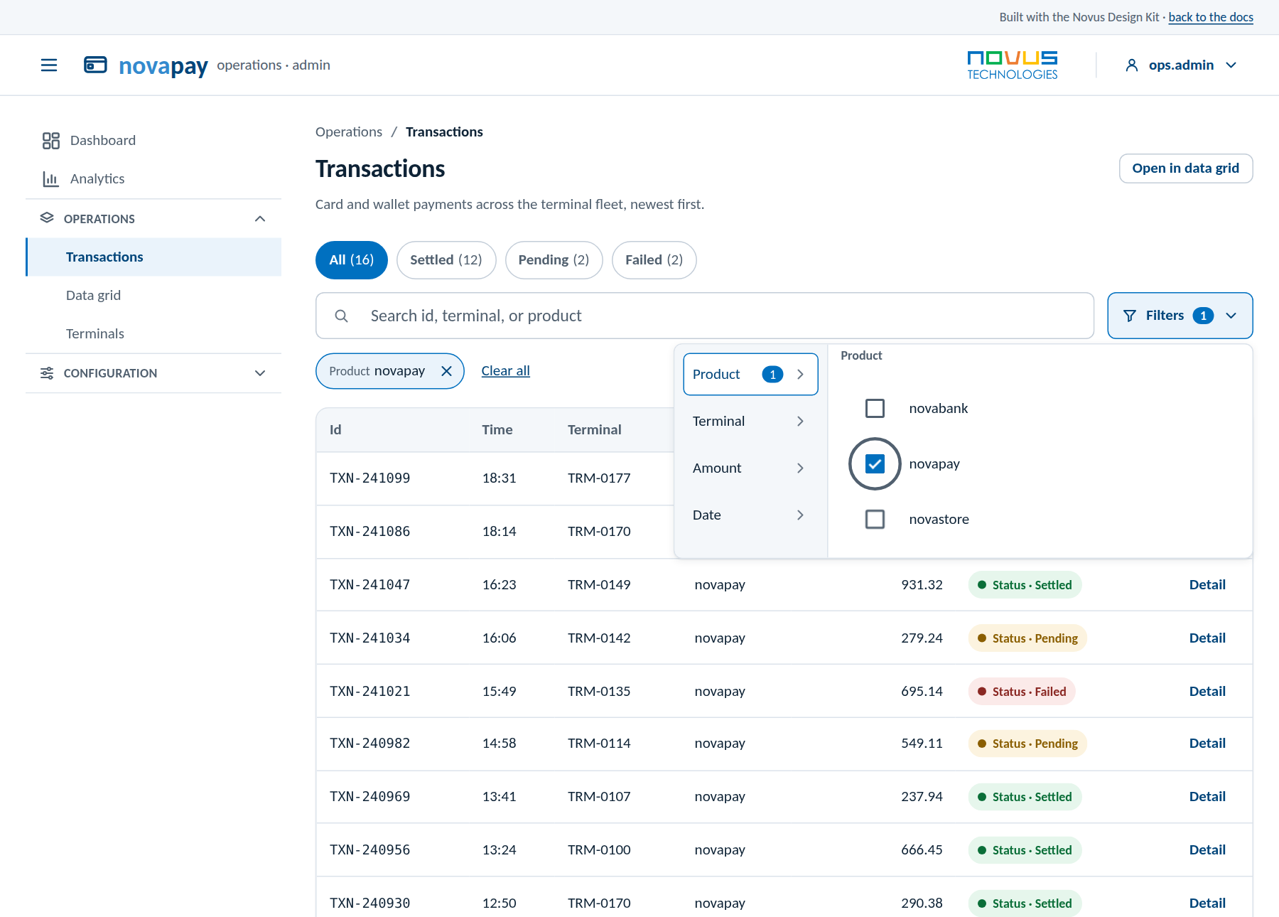
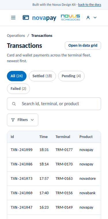
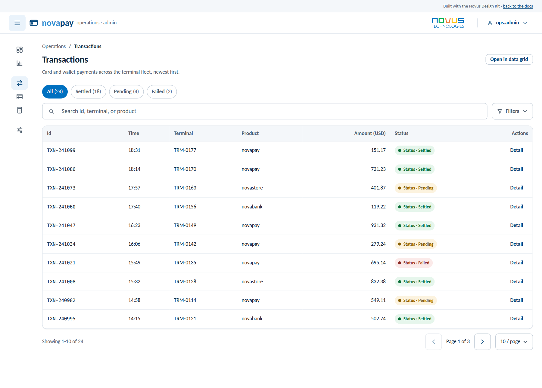
- Transactions: quick status chips with live counts, search, a Filters sheet with Product, Terminal, and Amount categories, removable active chips with Clear all, a native detail dialog, a plain empty state, and the list footer (range, previous and next, page label, rows per page).
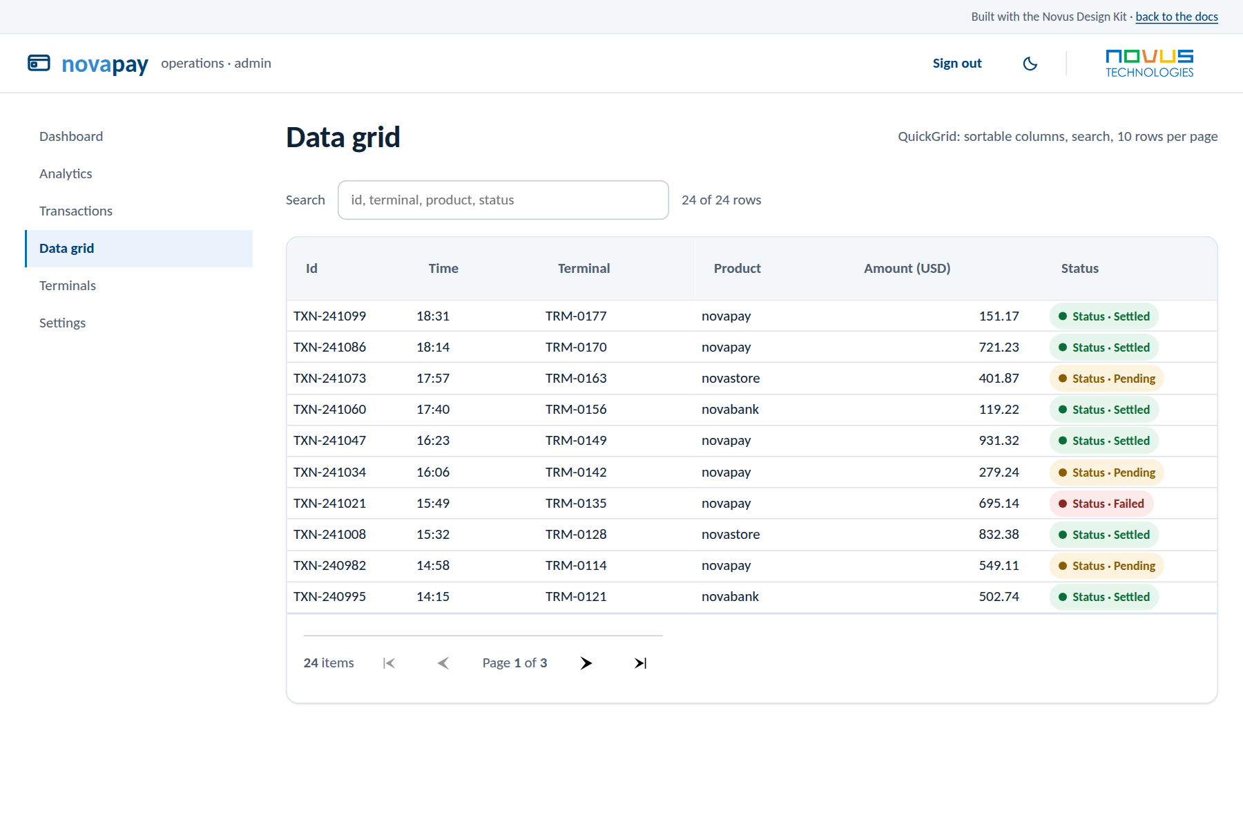
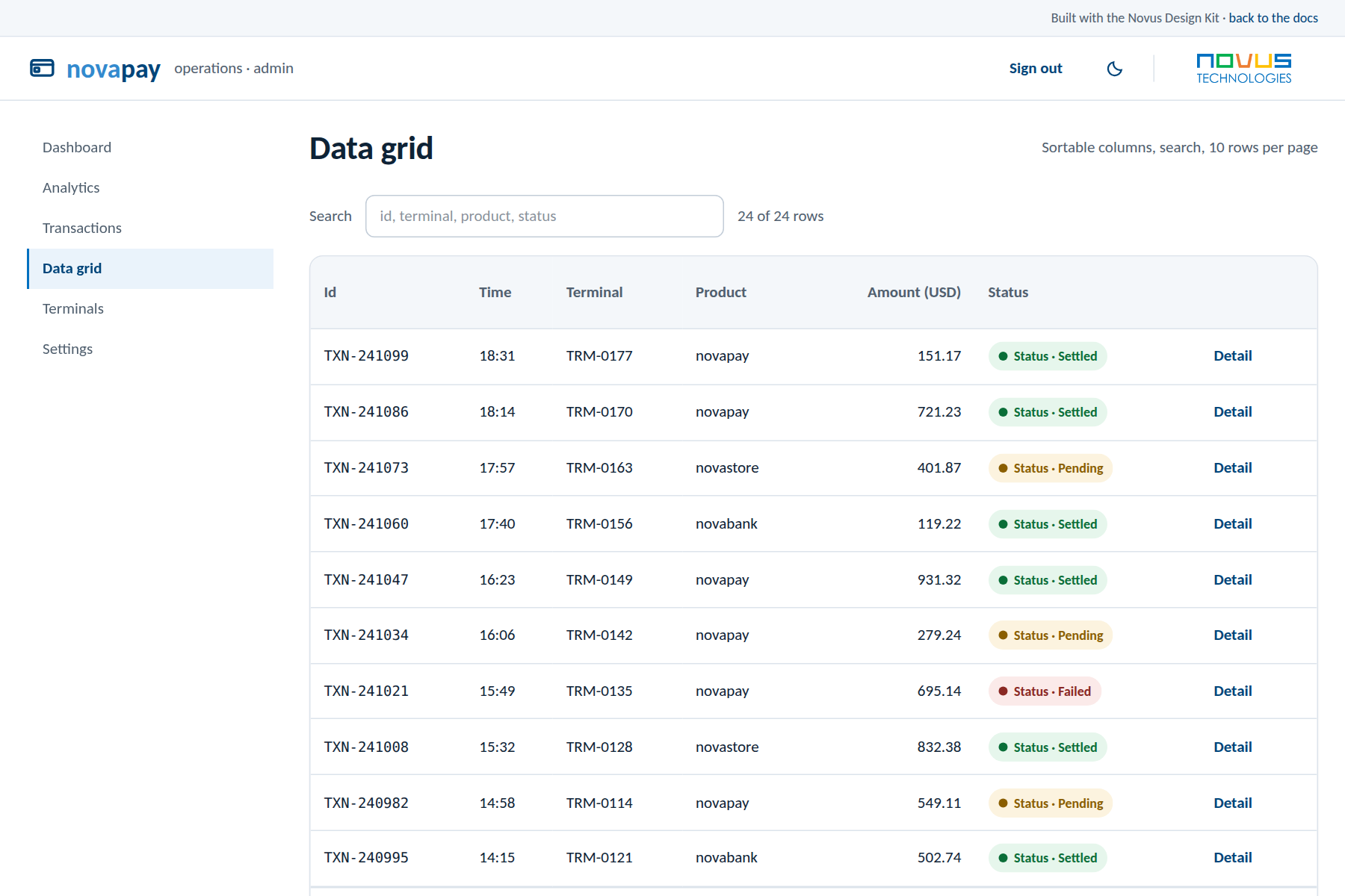
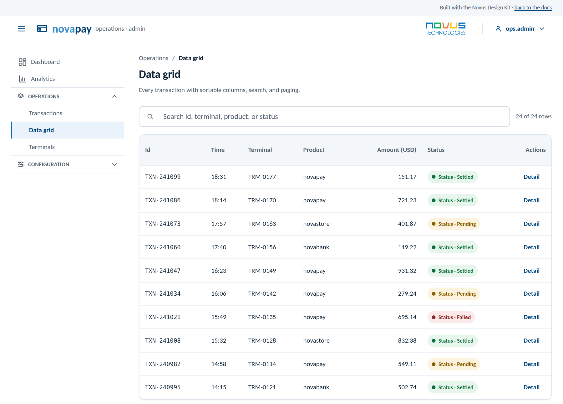
- Data grid: every transaction with column sorting, search, and the same list footer (Blazor QuickGrid; progressive enhanced table in the static flavors).
- Terminals: fleet health with degraded and offline devices sorted first.
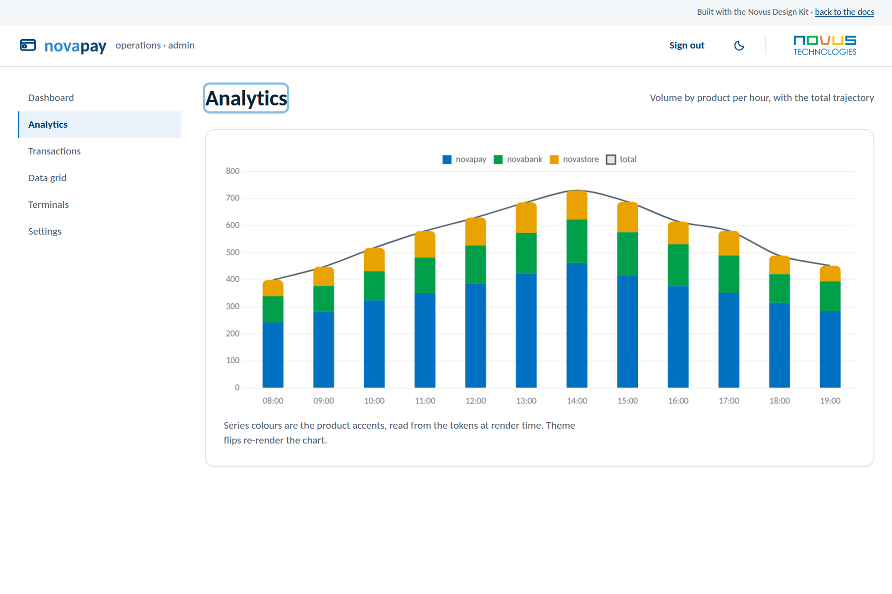
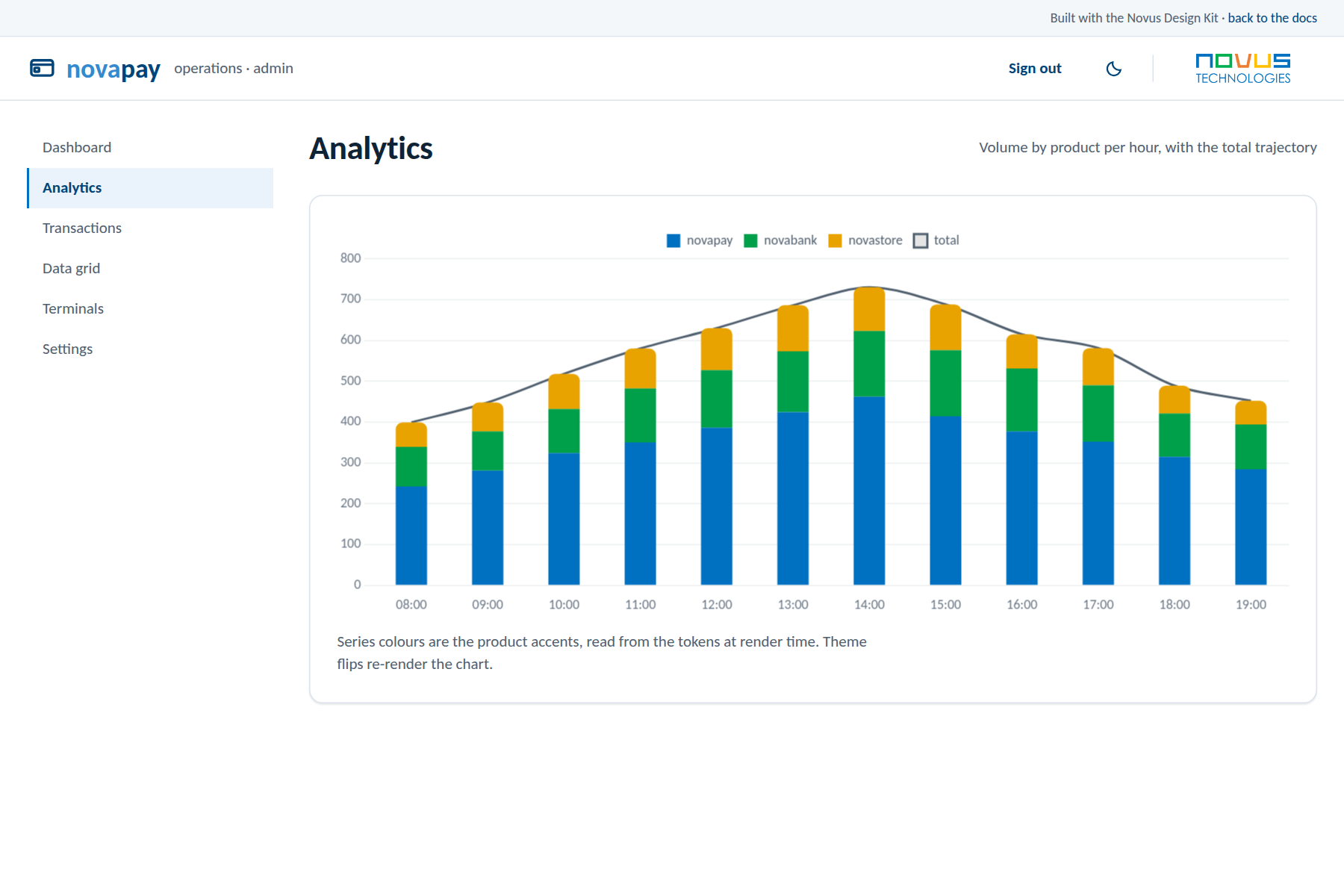
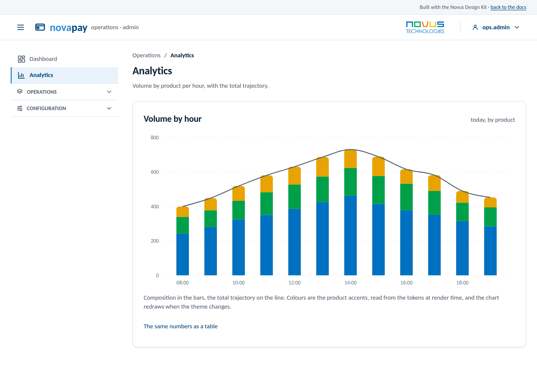
- Analytics: hourly volume by product drawn with D3 under the locked Novus chart rules, tokens read at render time, hover and keyboard tooltips, a redraw on theme change, and the same numbers as a table for pages without scripting.
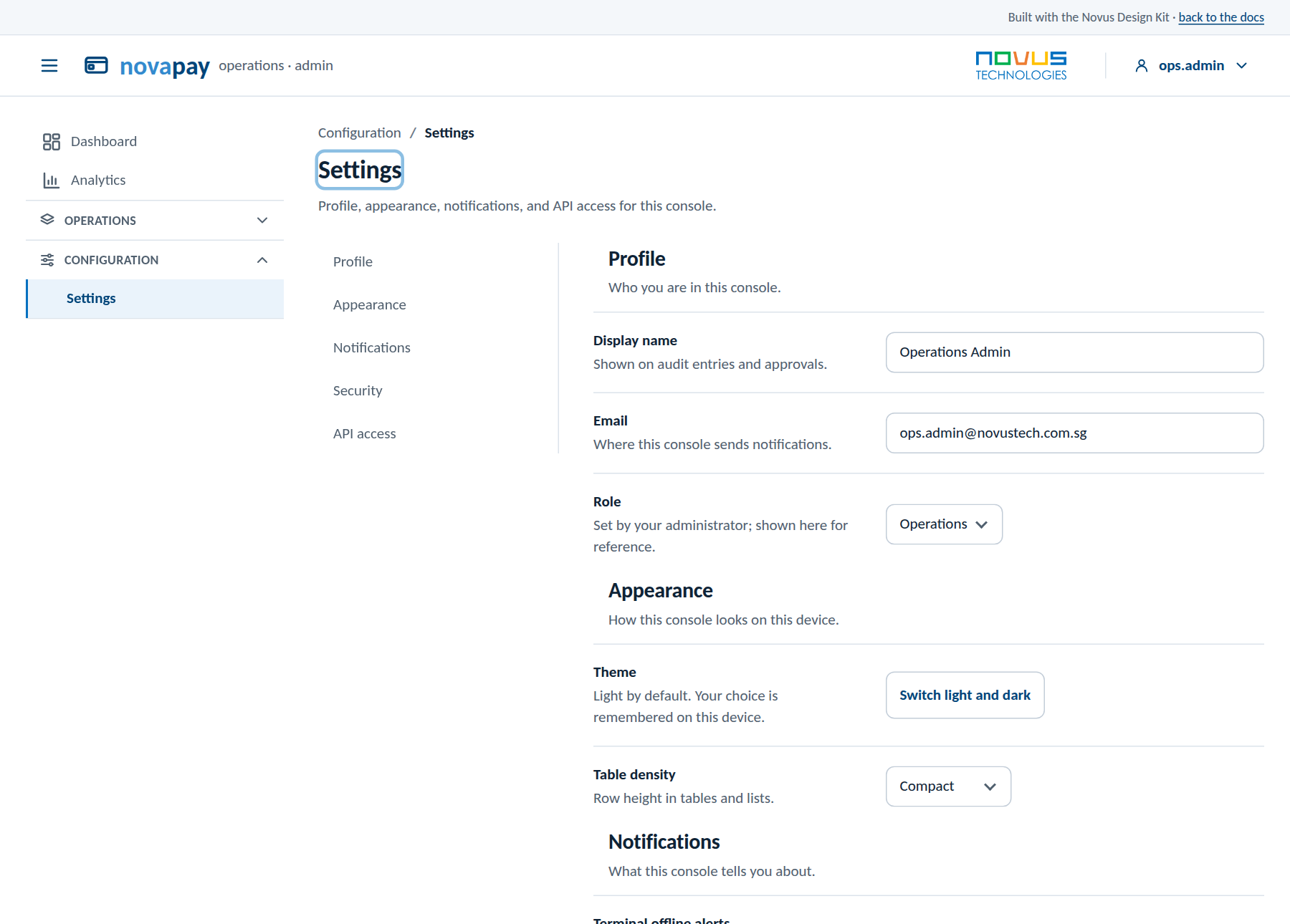
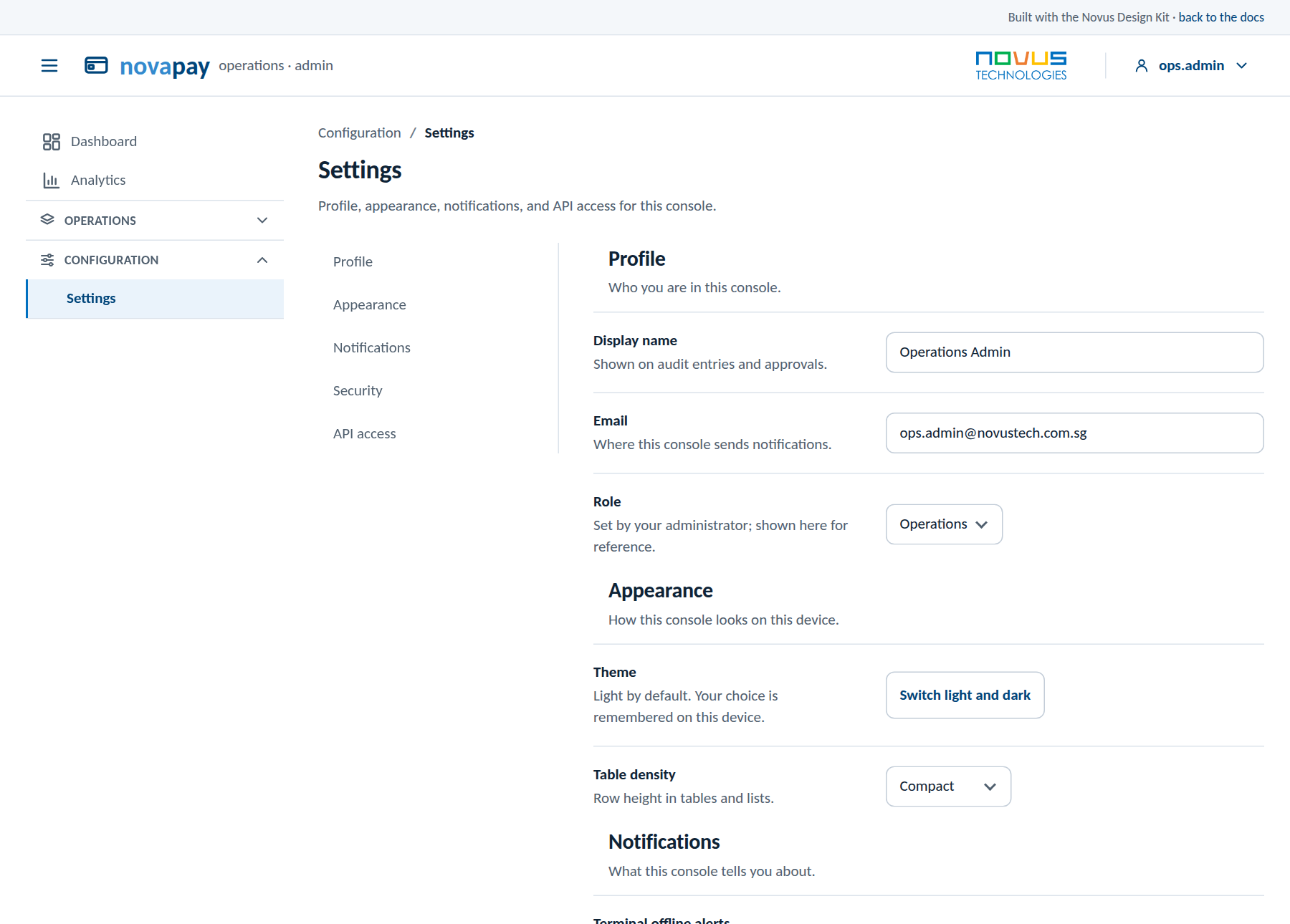
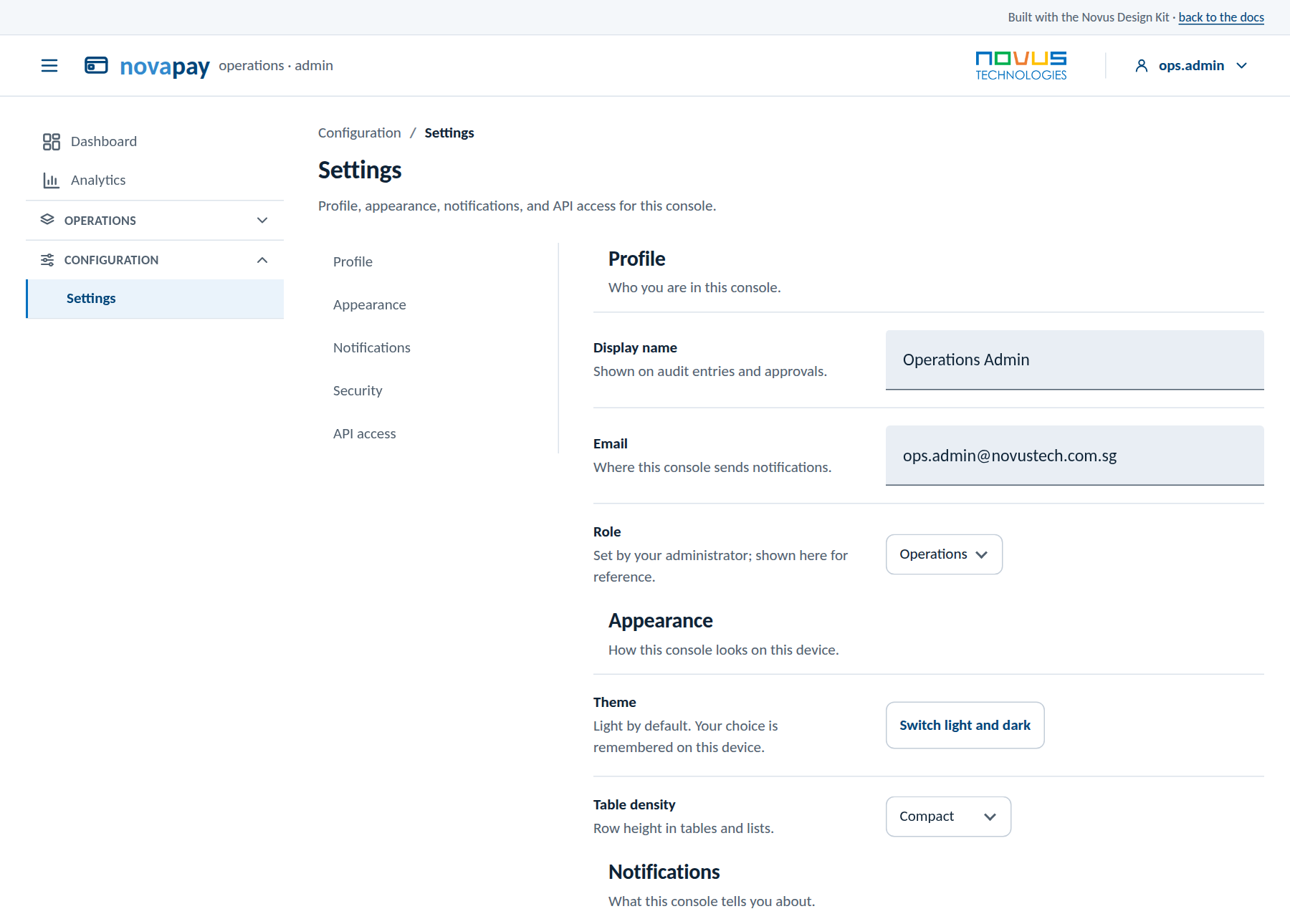
- Settings: the settings layout, a section menu beside grouped sections (Profile, Appearance, Notifications, Security, API access) of labelled rows, one control per row, working with JavaScript off.
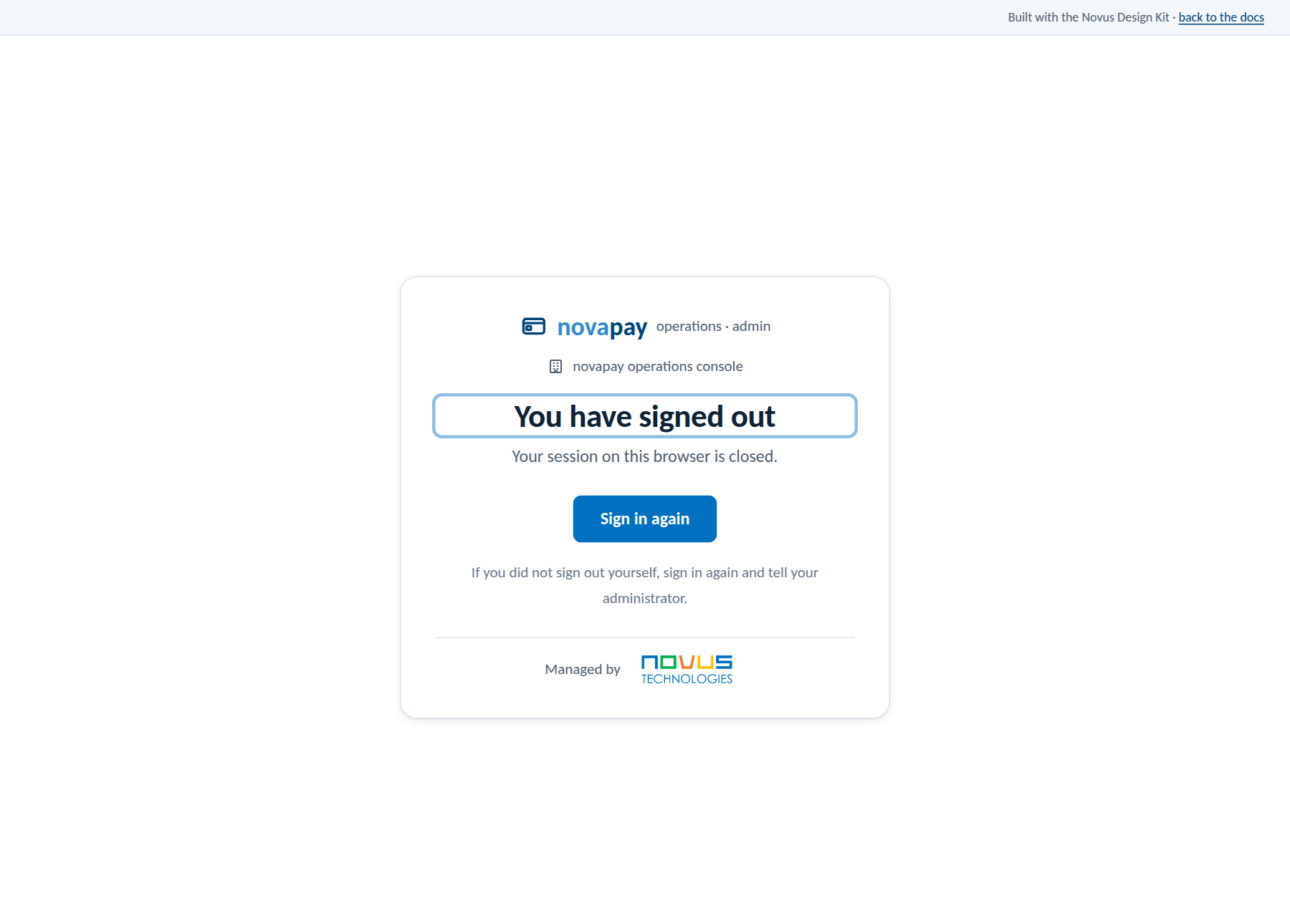
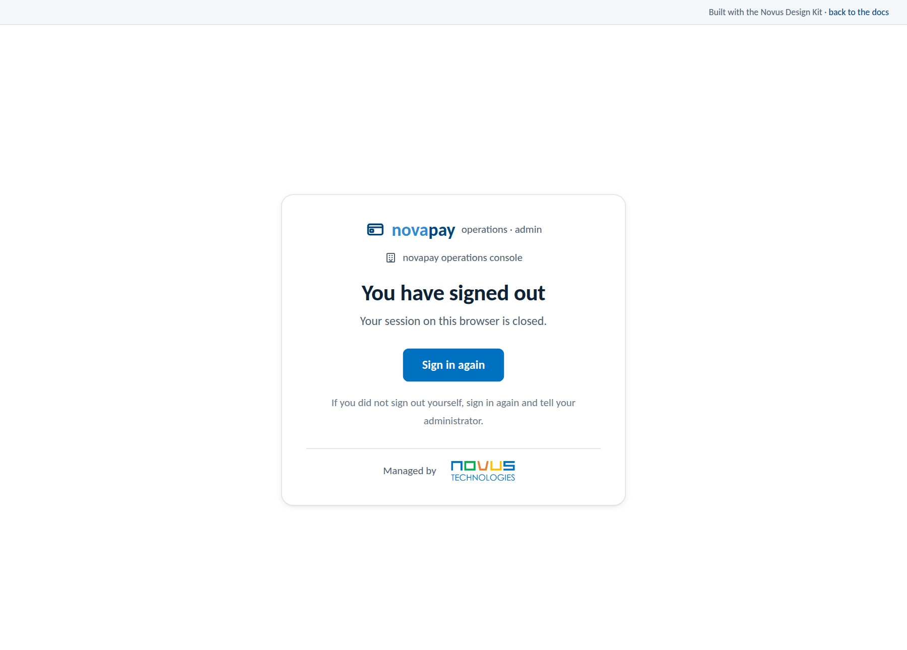
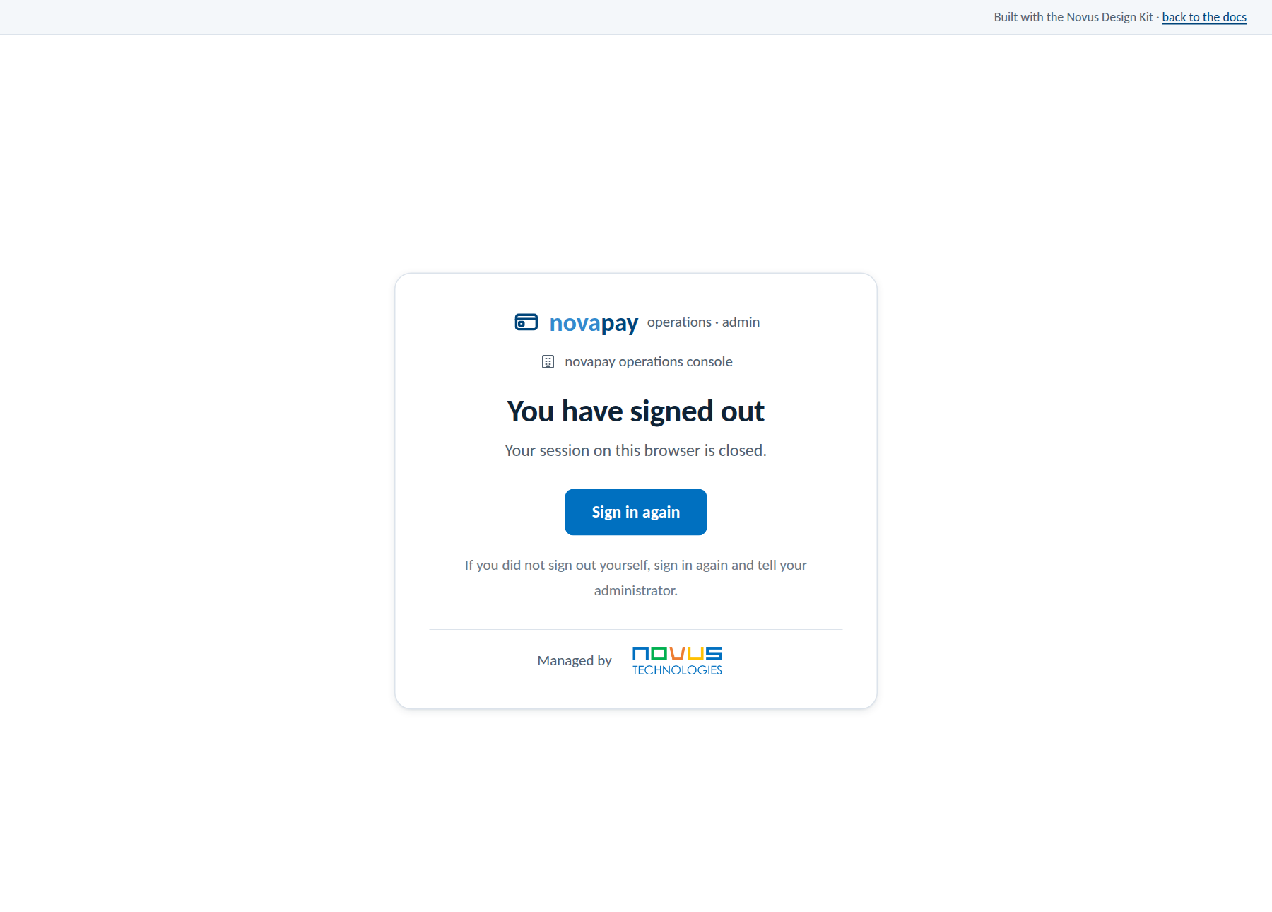
- Signed out: the centred card that confirms the session ended and offers Sign in again.
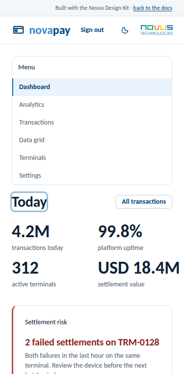
- Shell: menu toggle, product lockup, Novus endorsement, and a user menu holding the theme toggle and Sign out; grouped side navigation with line icons that collapses to a rail of icons at desktop width, so no destination is ever hidden, and opens as a drawer on phones, with no JavaScript required; a page header with breadcrumb and end-aligned actions on every screen.
- Content fit: identifiers, names, chips, dates, amounts, and headers stay on one line at every width; tables scroll inside their card instead of squeezing. The layout audit gate checks every screen at 1440px and 375px.
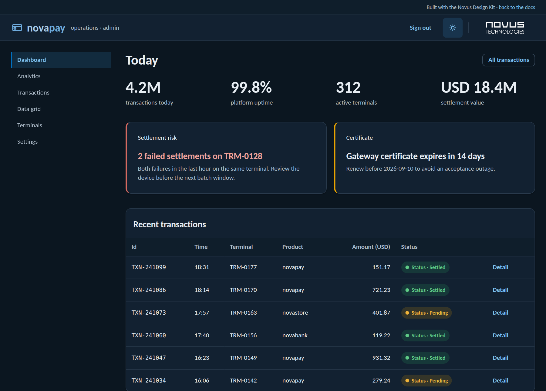
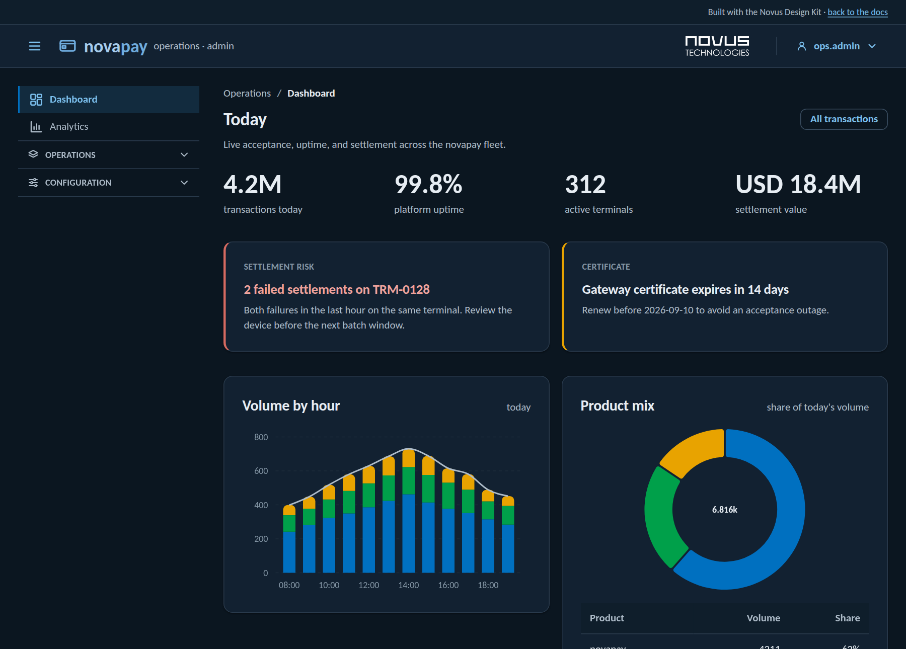
- Traffic-light colour only on judgement chips, amounts always neutral, self-describing chips, dual-trigger dark mode, functional motion of 0.2s or less that is removed under reduced-motion preferences.
Novus Admin Kit with Blazor
Blazor Web App (.NET 10): server-rendered pages, InteractiveServer only on the transactions filters and data grid; the sign-in page is a static server-rendered form post that works with JavaScript off. Verified 2026-09-23; screenshots below are from the verified run, and every image opens the live demo. The hosted demo is a WebAssembly build (requires JavaScript); the copyable flavor is server-rendered and works without it.
# copy admin-kits/blazor from the repository, then
npm install     # pulls novus-design-kit; the build copies it to wwwroot/lib
dotnet run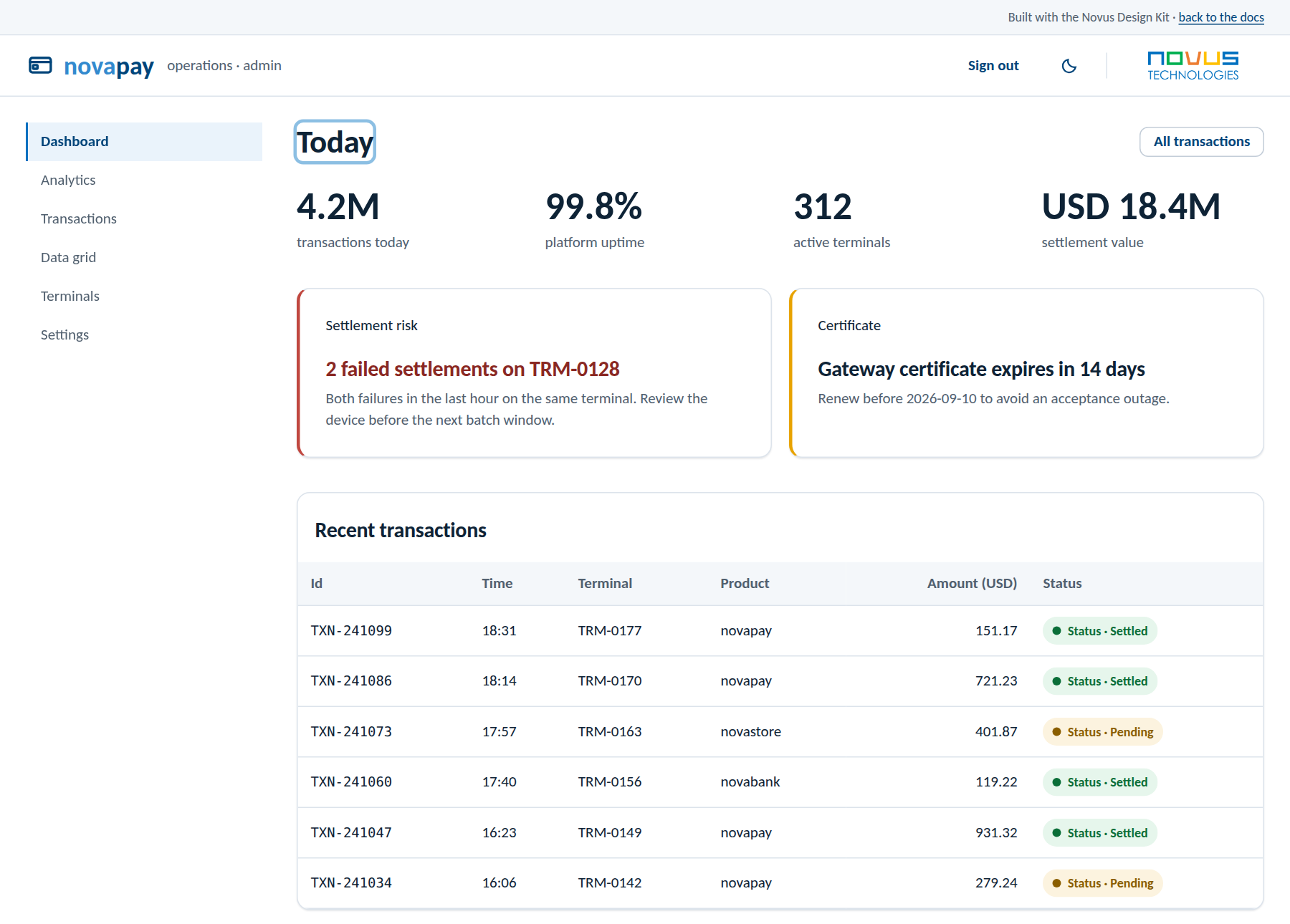
Novus Admin Kit with Tailwind
Vite multi-page app with Tailwind utilities mapped to the Novus tokens (the verified theme-guide pattern); vanilla JS only for the filter, dialog, and toggle. Verified 2026-09-23.
# copy admin-kits/tailwind from the repository, then
npm install
npm run dev     # or: npm run build && npm run preview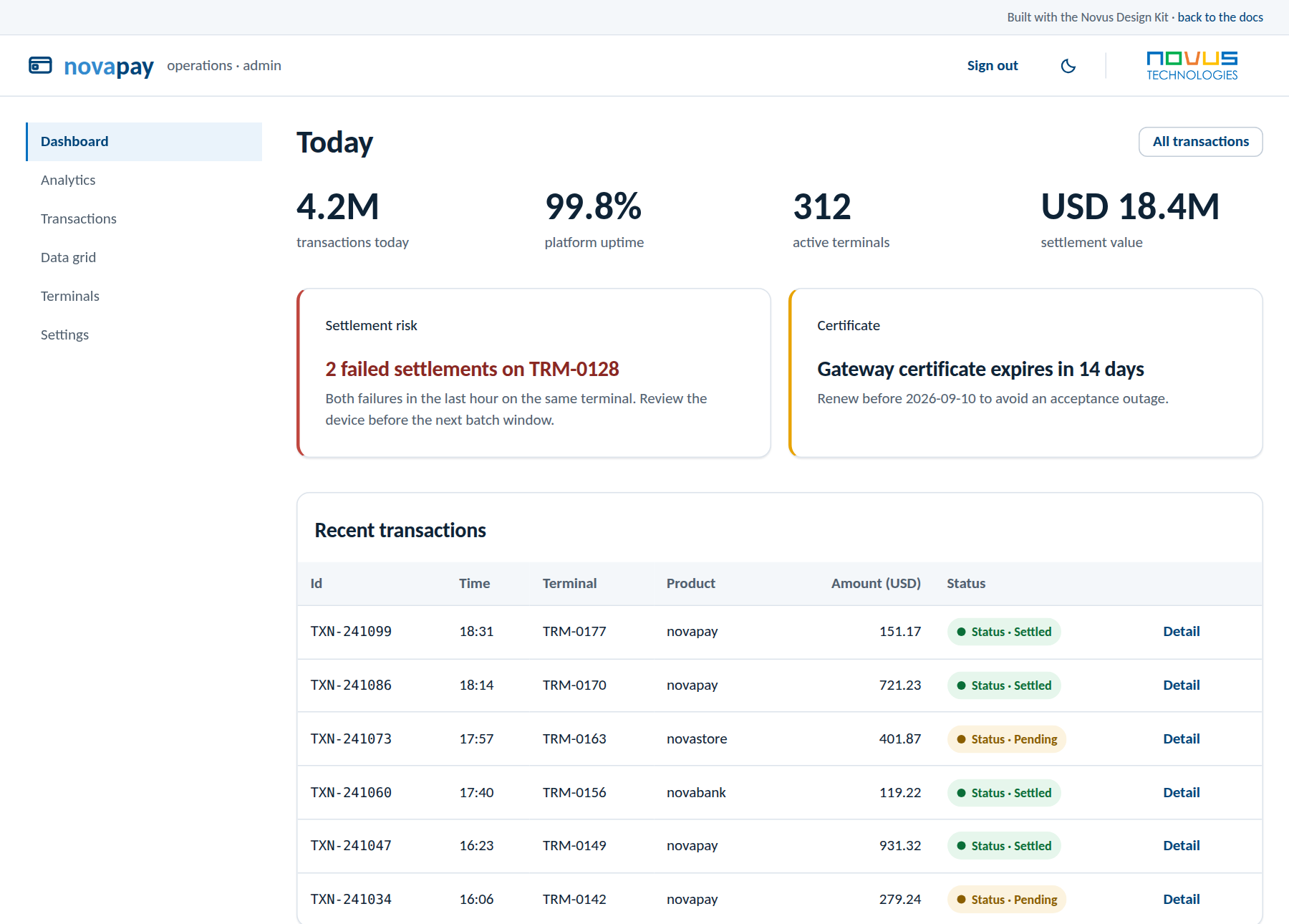
Novus Admin Kit with Material
Vite multi-page app on Material Web (@material/web 2.5, the official
m3.material.io web components) under the Novus tokens: MD3 system tokens map to the
kit variables in one CSS file (the verified Material
Web theme guide pattern), so dark mode flips the whole component set with no
extra code. Buttons, text fields, selects, and checkboxes are Material Web
components; layout, chips, and charts are the kit's. Material Web components
require JavaScript. Verified 2026-09-23.
# copy admin-kits/material from the repository, then
npm install
npm run dev     # or: npm run build && npm run preview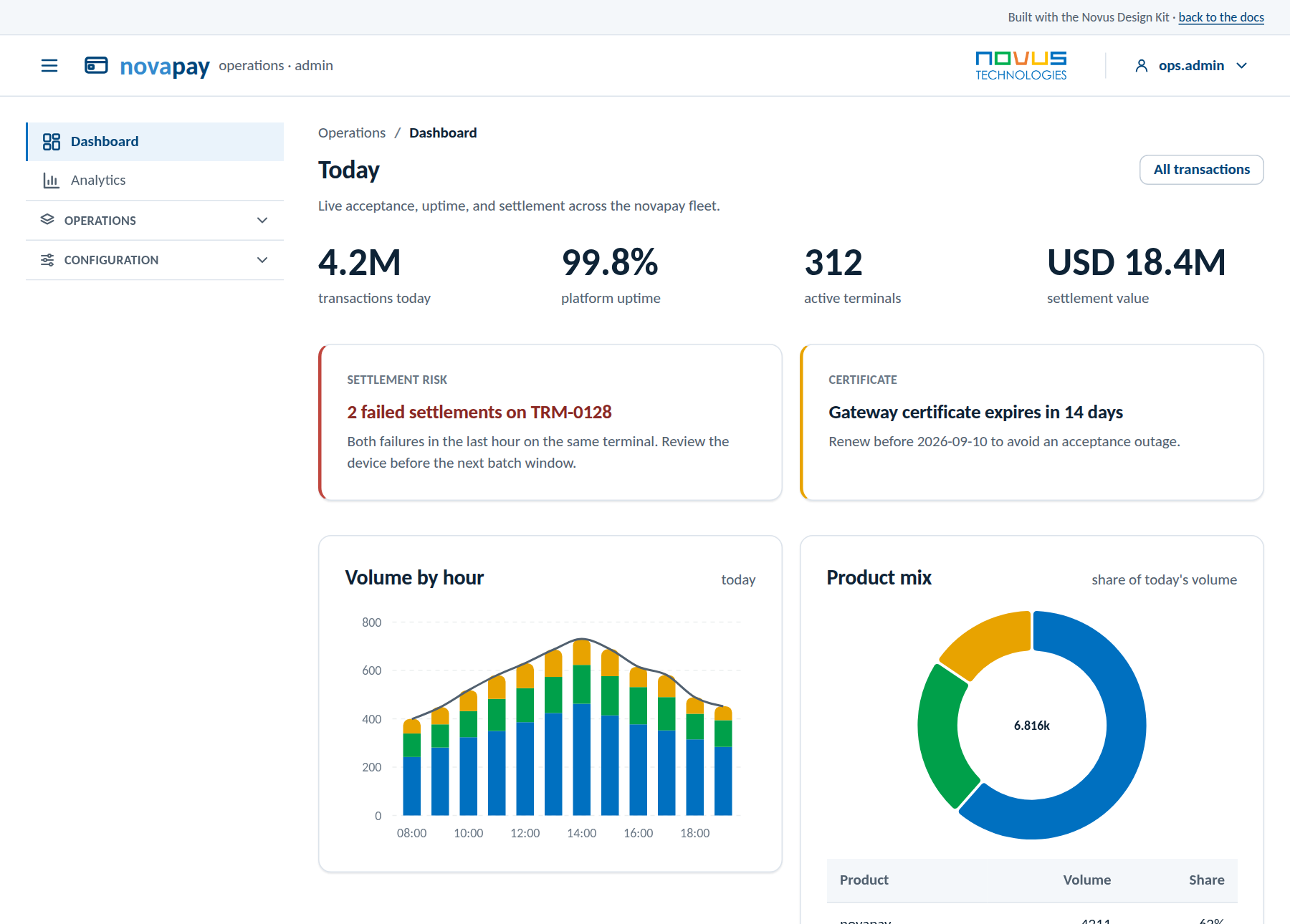
Choosing a console shell
A console uses one of two shells. Both carry the same header with the account menu last, the same page header, filter bar, paged lists and settings layout, and both render from one navigation definition, so moving between them is a shell change rather than a rebuild. Below 900px they present the same drawer.
| Shell | Use it when | Because |
|---|---|---|
| Side navigation (default) | A console has many top-level areas, or its structure is deep. | A rail shows every destination at once, and collapsing it keeps them one click away as icons. |
| Top navigation | A console has a handful of sections, up to about nine, each holding a short menu. | A horizontal bar reads as the product's spine and returns the full width to the work. Past about nine sections it hides more than it shows, and the side navigation is the better choice. |
The top-navigation menus open on click, never on hover, and are built on native disclosure elements, so they work with JavaScript off. The current section stays marked while its menu is shut, and a release gate checks that the bar reaches every destination the navigation defines.
Parity and data
- One dataset (
admin-kits/data/dataset.json) and one shared layer (admin-kits/shared/) generate every flavor's data, console shell, icons, and filter markup;node admin-kits/data/generate.mjs --checkproves parity and runs as a release gate. - Figures are illustrative; no client names appear in the demo data.
- Dashboards use stat rows and signal cards, the kit's own convention, instead of a charting library.