

Themes
Novus Design with Material Web
Teams following m3.material.io on the web use Material Web
(@material/web), Google's official Material Design 3 web components.
MD3's system tokens are plain CSS custom properties, which makes this the
cleanest Material pairing of all: point --md-sys-* at the Novus
variables once and every component follows, dark mode included, with no runtime
reads and no rebuild on theme flip. Verified against @material/web 2.5.
1. Load the kit alongside Material Web
npm install novus-design-kit @material/webimport "novus-design-kit/js/novus-theme.js";
import "novus-design-kit/tokens.css";
import "./novus-material-web.css";
import "@material/web/button/filled-button.js";
import "@material/web/textfield/outlined-text-field.js";
// import each component you use2. Map the MD3 system tokens to Novus (one file, no JavaScript)
/* novus-material-web.css */
:root {
  --md-sys-color-primary: var(--accent);
  --md-sys-color-on-primary: var(--text-on-accent);
  --md-sys-color-primary-container: var(--accent-subtle);
  --md-sys-color-on-primary-container: var(--accent-text);
  --md-sys-color-secondary: var(--text-secondary);
  --md-sys-color-secondary-container: var(--bg-subtle);
  --md-sys-color-on-secondary-container: var(--text);
  --md-sys-color-surface: var(--surface);
  --md-sys-color-on-surface: var(--text);
  --md-sys-color-on-surface-variant: var(--text-secondary);
  --md-sys-color-surface-container: var(--bg-subtle);
  --md-sys-color-surface-container-highest: var(--bg-muted);
  --md-sys-color-outline: var(--border-strong);
  --md-sys-color-outline-variant: var(--border);
  --md-sys-color-error: var(--danger);
  --md-sys-color-on-error: var(--text-on-accent);
  --md-ref-typeface-plain: var(--font-sans);   /* Carlito everywhere */
  --md-ref-typeface-brand: var(--font-sans);
  /* MD3 defaults to pill buttons; the kit is near-flat */
  --md-filled-button-container-shape: var(--radius-md);
  --md-outlined-button-container-shape: var(--radius-md);
  --md-text-button-container-shape: var(--radius-md);
  --md-outlined-text-field-container-shape: var(--radius-md);
}
3. Dark mode is free
Because every mapping is a var() reference, the kit's dual-trigger
dark mode (OS preference and the persisted toggle from
novus-theme.js) flips the MD3 palette with zero extra code. This is
the difference from the MUI guide, where palette
colours must be re-read at runtime.
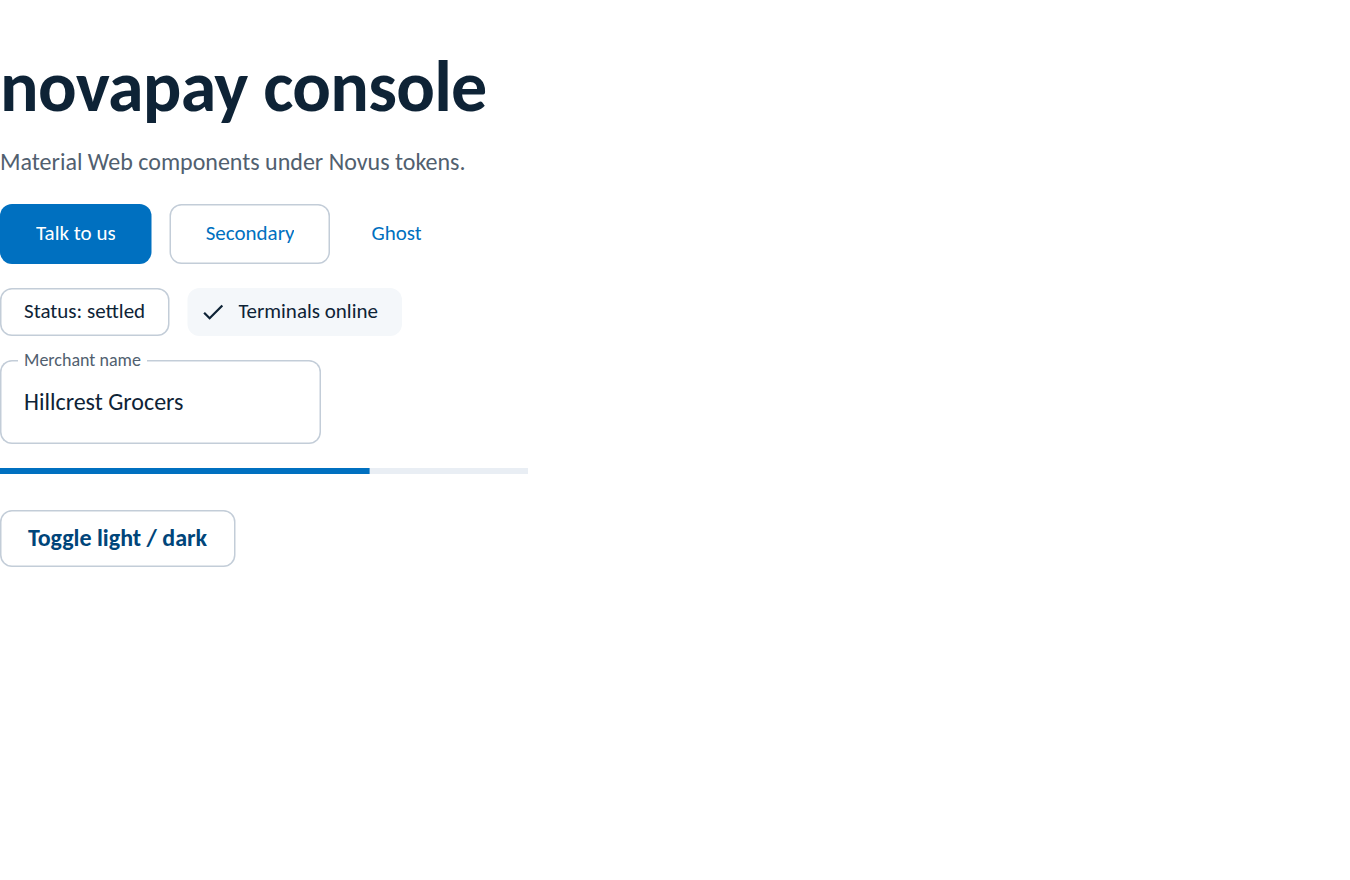
Verified result
Rendered from this guide's own sample project, executed and verified on 2026-08-27 against @material/web 2.5.0 (Vite 8, novus-design-kit 0.3.0 from the public registry). The dark flip was exercised through the kit toggle in the same run.
Rules of the road
- Map system tokens (
--md-sys-*) first and reach for component tokens (--md-filled-button-*) only where a shape or density must be corrected toward the kit, as with the pill-to-radius change above. - One accent per view still applies:
md-filled-buttonis the single primary action; everything else is outlined or text. - Chips must be self-describing and status colour appears only on judgements; MD3's tonal chips inherit the mapped containers, so no extra work.
- Where a Material Web component and a kit component overlap (buttons, chips), prefer the kit's class-based component on brand-critical surfaces.
- Logos remain placed assets from the package, theming never touches them.
- Note the project status: Material Web is in maintenance mode upstream; it remains the official m3.material.io web implementation, but weigh that for long-lived products.