

Frameworks
Novus Design for Blazor
The kit is plain CSS + static assets, so Blazor (Server and WebAssembly) consumes it
with no wrapper library: serve the package from wwwroot, link one
stylesheet, and use the component classes in your Razor markup.
1. Get the package into wwwroot
The MSBuild target below copies from node_modules/novus-design-kit.
That folder is created by running npm install novus-design-kit in your
project folder (the tokenless public npm package): add a minimal
package.json next to your .csproj if you don't have one.
No Node at all? Two alternatives: download the exact release tarball from the
GitHub releases
(the .tgz attached to each version) and extract it to a folder of your choice, or
clone the repository and copy the kit files; then point the target's
Include path at that folder instead of node_modules. npm is the
recommended route because npm update then handles upgrades.
# in the Blazor project folder (next to the .csproj)
npm install novus-design-kit
Then copy the package into wwwroot/lib at build time with an MSBuild
target in your .csproj (note BeforeTargets="PrepareForBuild":
copying into wwwroot later than that breaks asset fingerprinting on clean builds):
<Target Name="CopyNovusKit" BeforeTargets="PrepareForBuild">
  <ItemGroup>
    <NovusKit Include="node_modules/novus-design-kit/**/*" />
  </ItemGroup>
  <Copy SourceFiles="@(NovusKit)"
        DestinationFiles="@(NovusKit->'wwwroot/lib/novus-design-kit/%(RecursiveDir)%(Filename)%(Extension)')"
        SkipUnchangedFiles="true" />
</Target>
2. Link it once
In Components/App.razor (.NET 8+) or wwwroot/index.html
(WebAssembly), inside <head>:
<link rel="stylesheet" href="lib/novus-design-kit/tokens.css" />
<script src="lib/novus-design-kit/js/novus-theme.js"></script>
3. Use the classes in Razor markup
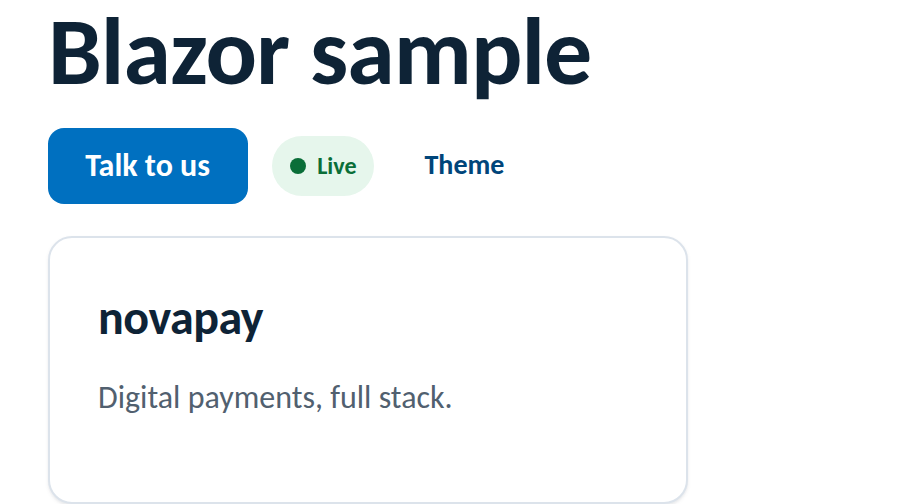
<button class="btn btn--primary" @onclick="Submit">Talk to us</button>

<div class="card card--interactive" style="position:relative">
    <h3>@Title</h3>
    <p class="muted">@Summary</p>
    <button class="card-trigger" aria-label="Open" @onclick="Open"></button>
</div>
4. Theme toggle via JS interop
@inject IJSRuntime JS

<button class="btn btn--ghost btn--sm" @onclick="Toggle">Theme</button>

@code {
    private async Task Toggle() =>
        await JS.InvokeVoidAsync("novusTheme.toggle");
}
Verified result
Rendered from this guide's own sample project, executed and verified on 2026-08-26 against the .NET SDK 10.0 Blazor Web App template.
Rules of the road
- The default Blazor template ships Bootstrap and an app.css, and Bootstrap's
.btncollides with the kit's. Remove those two stylesheet links fromApp.razor: the kit replaces them. - The kit's classes are global by design, they compose with Blazor CSS isolation; you never need
::deepto reach them. - Don't re-declare brand values in component-scoped CSS; reference
var(--…)tokens there too. - Keep the theme script in
<head>so the persisted choice applies before first render. - Pairing with Fluent UI Blazor? See Novus Design with Fluent 2, Novus tokens stay the source of truth.