

Frameworks
Novus Design for Vue.js
Vue single-file components use the kit's classes directly in templates. Import the
stylesheet once in main.js; scoped styles coexist cleanly because the
kit's classes are global and its tokens are CSS variables.
1. Install and wire
npm install novus-design-kit// main.js
import "novus-design-kit/js/novus-theme.js";
import "novus-design-kit/tokens.css";
import { createApp } from "vue";
import App from "./App.vue";
createApp(App).mount("#app");2. Use the classes in a single-file component
<script setup>
defineProps(["title", "summary"]);
const emit = defineEmits(["open"]);
const toggleTheme = () => window.novusTheme.toggle();
</script>

<template>
  <div class="card card--interactive" style="position: relative">
    <h3>{{ title }}</h3>
    <p class="muted">{{ summary }}</p>
    <button class="card-trigger" :aria-label="`Open ${title}`" @click="emit('open')" />
  </div>
  <button class="btn btn--ghost btn--sm" @click="toggleTheme">Theme</button>
</template>
3. Scoped styles stay on tokens
<style scoped>
.detail {
  padding: var(--space-4);
  border-top: 1px solid var(--border);
  color: var(--text-secondary);
}
</style>
Verified result
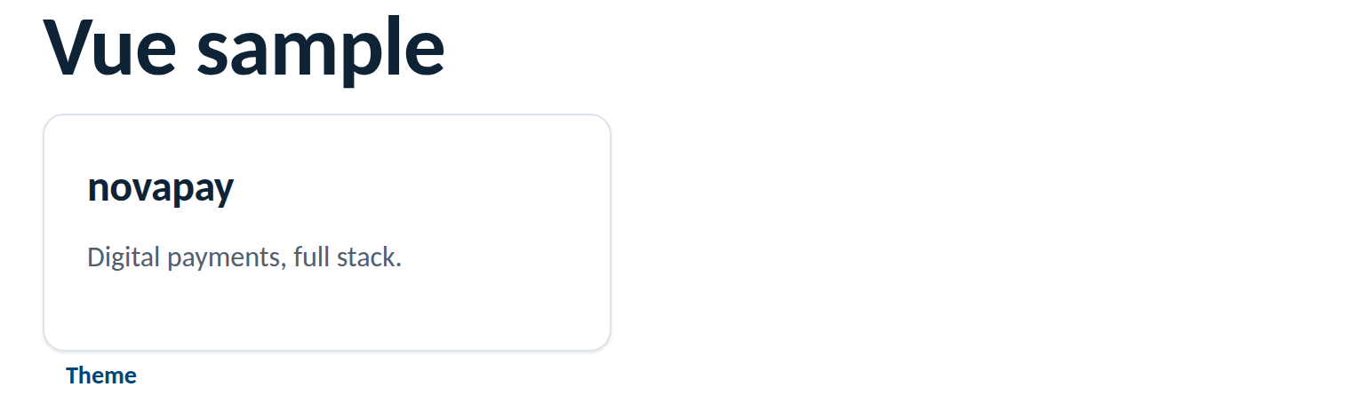
Rendered from this guide's own sample project, executed and verified on 2026-08-26 against vue 3.5 on vite 8.
Rules of the road
- Kit classes are global, no
:deep()needed to use them inside scoped components. - Scoped styles reference
var(--…)tokens; never re-declare a value the tokens define. - Keep the theme import first in
main.jsso the persisted choice applies as early as possible. - Adding a component library? Theme it from the tokens, see Ant Design or Material.